Additional Research
Deeper findings from site visits, the food itself, the audience, competitor walks, and BeltLine location analysis that shaped the rebrand direction.
Four visits, one clear story.
Each visit focused on a different lens: arrival flow, interior atmosphere, service rhythm, and how guests actually used the space.
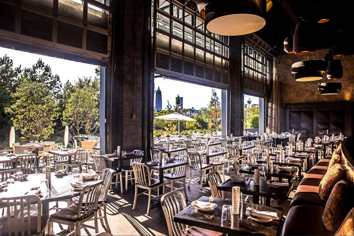
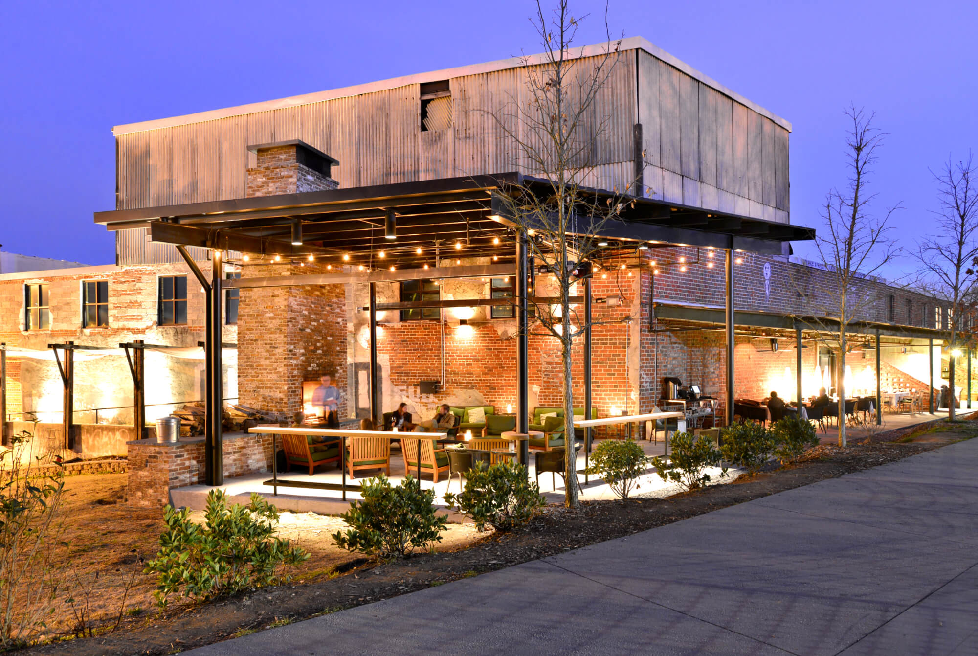
The restaurant reads as two different places depending on how you arrive. From the parking lot, the signage is clear. From the BeltLine, the building almost disappears behind greenery and the trail curve.
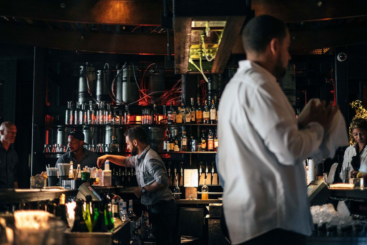
Guests linger at the bar before being seated. The bar is a social anchor — but it has no branded moments beyond the menu. A strong mark here would prime the meal before guests even reach the table.
The menu is handed over as a flat, single-sheet print piece. At this price point, the menu feels more like a diner handout than a $30–$62 entrée experience.
Staff uniforms are minimal black. Adding an embroidered mark or a subtle pattern would extend the brand into the dining room without feeling costume-like.
Bold flavors, generous portions.
Four visits in, the same conclusion every time — the kitchen delivers. The food is the loudest part of the brand, and the identity needed to match it.
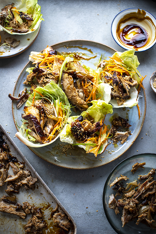
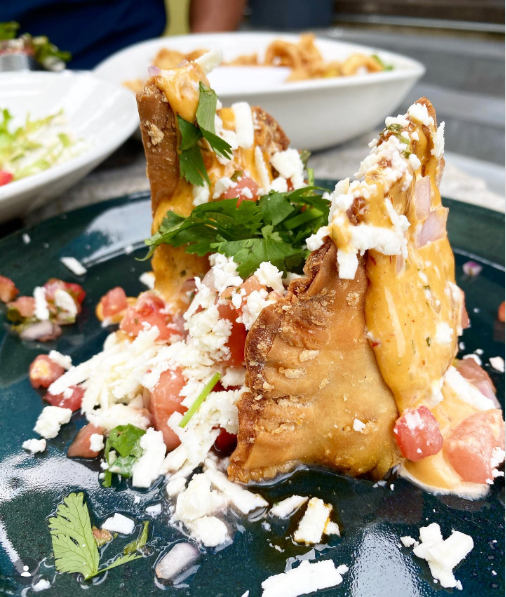
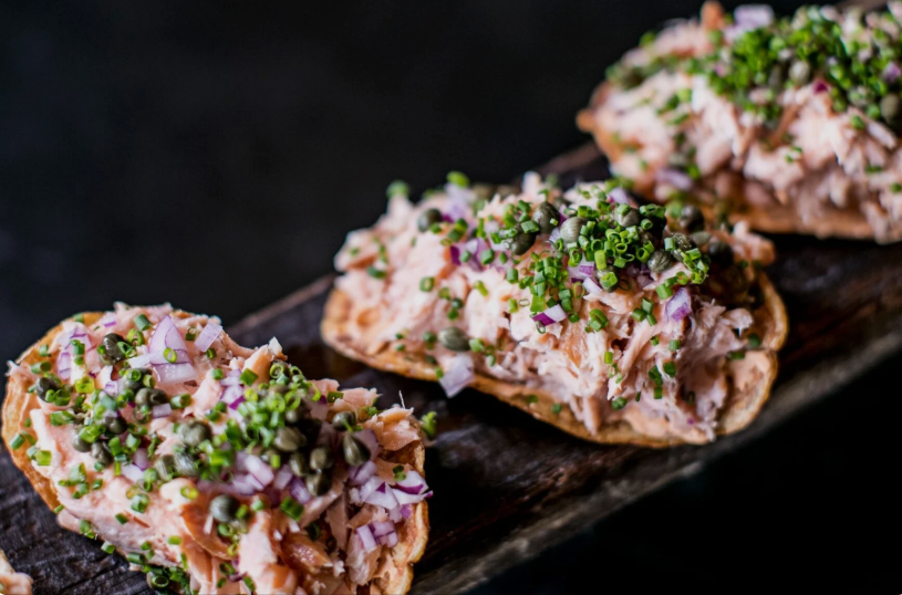
Four visits in. Same conclusion: bold flavors, generous portions.
The salmon chips are the crowd favorite. The brisket empanadas are right behind them — savory filling, golden flaky crust, you'll order seconds. The pork belly salad wraps stood out for me: crispy on the outside, juicy and flavorful inside. Prices skew high, but the quality and portions justify the cost for a date night or special occasion.
Two guests. One bold table.
The audience enjoys bold flavors, creative cocktails and an environment suited to both casual gatherings and special celebrations — locals and tourists looking for an energetic, memorable night out in Atlanta.

"Take me somewhere with a vibe I'll want to post about."
Values ambiance and creativity in food. Comes for cocktails after work, brings friends for weekend brunch, looks for spots that feel discovered.
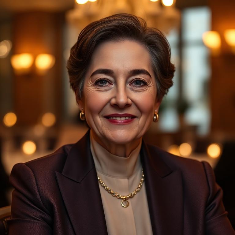
"We're celebrating something — make it memorable."
Appreciates fine dining and visits for special occasions or gatherings. Enjoys the lively yet comfortable ambiance and eclectic menu, often during quieter hours.
Who else is feeding this block.
Two BeltLine-adjacent restaurants compete for the same Atlanta diner. Mapping their concept and atmosphere revealed exactly where Two Urban Licks could stand apart.
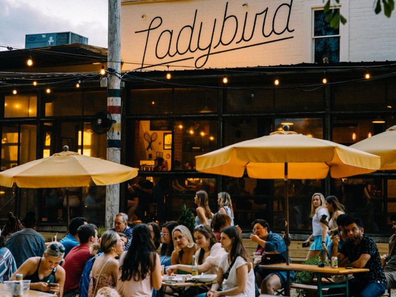
Relaxed, campfire-inspired dining on the BeltLine. "Elevated campfire cuisine" — shareable BBQ boards, oyster po'boys — social, outdoorsy "backyard" branding for locals and tourists.
Upscale steakhouse on the eastern edge of the BeltLine. Refined, classic-steakhouse atmosphere — special-occasion dining anchored in tradition rather than experimentation.
Ladybird owns "backyard." Rathbun owns "classic." No one on the BeltLine owns artistic, urban, fiery — that's where Two Urban Licks belongs.
What people actually say.
Quotes pulled from review sites, social posts, and informal conversations during site visits.
"The salmon chips are the only reason I come back."
"We walked past it twice before we realized it was the restaurant."
"It feels like a place that should have a stronger logo."
"Great date spot, but the menu doesn't feel special enough for the price."
"The patio is everything. That's what needs to be on the poster."
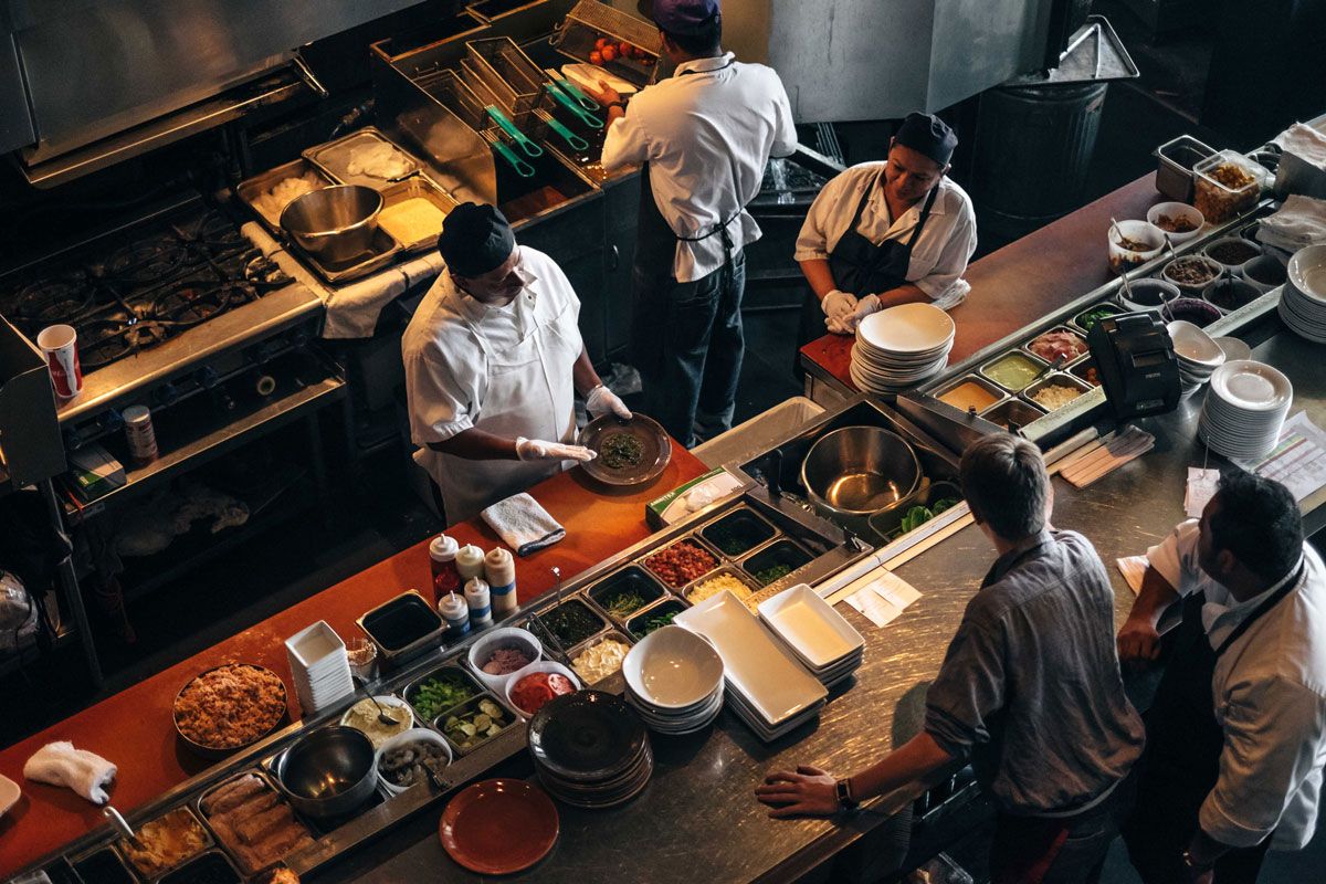
"I love the open kitchen. You can tell they're serious about the fire."
Where the brand can win.
Six concrete opportunities that emerged from the research and directly informed the design system.
Turn the numeral into a public-art landmark visible from the BeltLine.
Make wood-fired cooking a visual motif, not just a menu descriptor.
Elevate the printed and digital menu to match the $30–$62 entrée promise.
Add subtle branded uniform details that guests photograph naturally.
Create a sequence of moments from BeltLine approach to host stand.
Use the Picasso-inspired mark to claim the creative, urban territory.
Back to the full case study
See how the research translated into identity, applications, and environmental design.