Two
Urban
Licks
Known for its open-fire cuisine, live music, and vibrant atmosphere, TWO Urban Licks delivers a memorable dining experience.
However, its visual identity lacked the presence needed to reflect the restaurant's energy and capture the attention of the thousands of people who pass by on the Atlanta BeltLine each day.
This rebrand bridges the gap between experience and perception, creating a bold brand system designed for visibility, wayfinding, and discovery.
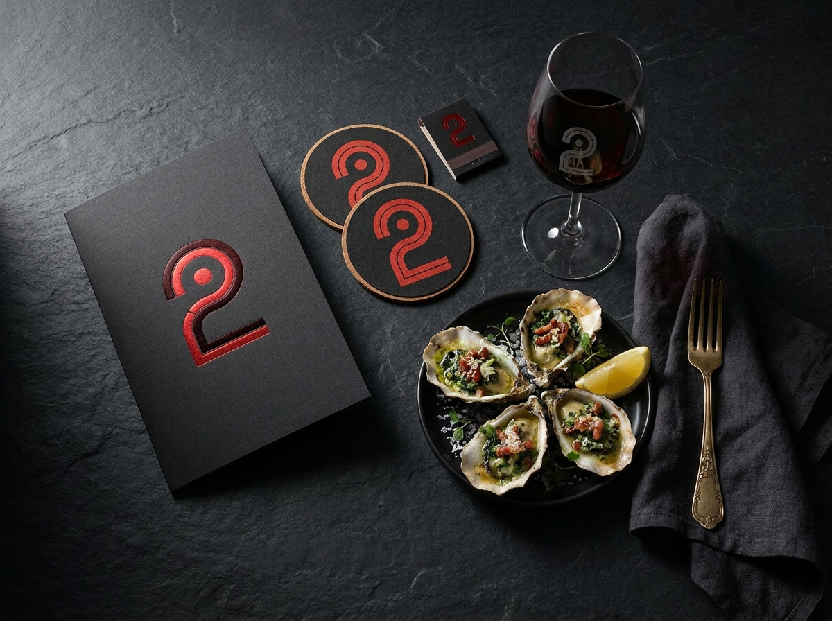
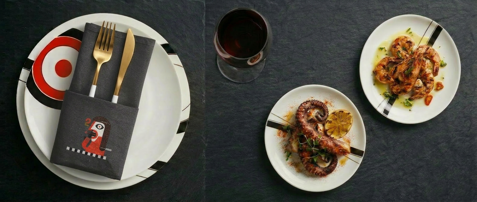
Bold flavor. Open fire. Urban edge.
Reimagining TWO Urban Licks as one of Atlanta's most recognizable BeltLine destinations through a cohesive brand identity, environmental graphics, and a wayfinding system inspired by the iconic number "2".
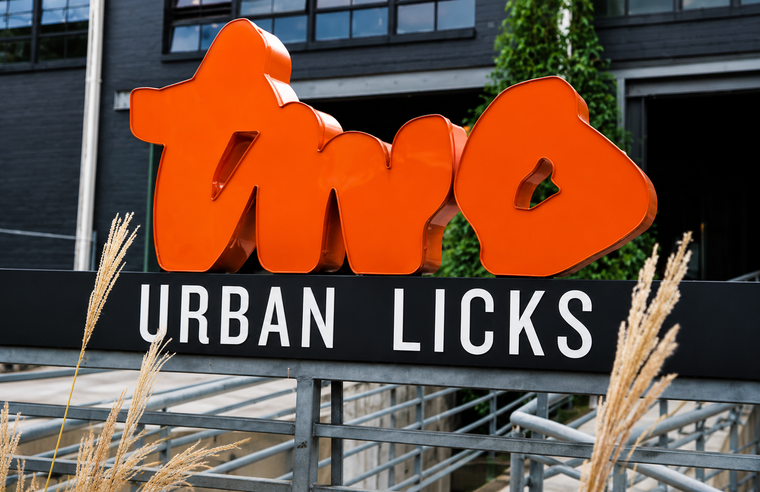
Misson
Strengthen TWO Urban Licks as one of Atlanta's most recognizable BeltLine destinations through a cohesive brand identity that extends from trail to table.
The Problem
TWO Urban Licks delivers a bold dining experience defined by open-fire cuisine, live music, and an energetic atmosphere. Yet its visual identity and signage maintain a quieter presence, with most visibility oriented toward street arrivals rather than the Atlanta BeltLine. The opportunity was to create a stronger BeltLine presence, modernize the brand, and improve guest navigation.
The Solution
The rebrand centers around a custom "2" symbol that functions as both a brand mark and a wayfinding device. The identity extends across environmental graphics, signage, menus, and digital applications, creating a BeltLine-facing system that guides visitors from trail to table.
Researching Two Urban Licks.
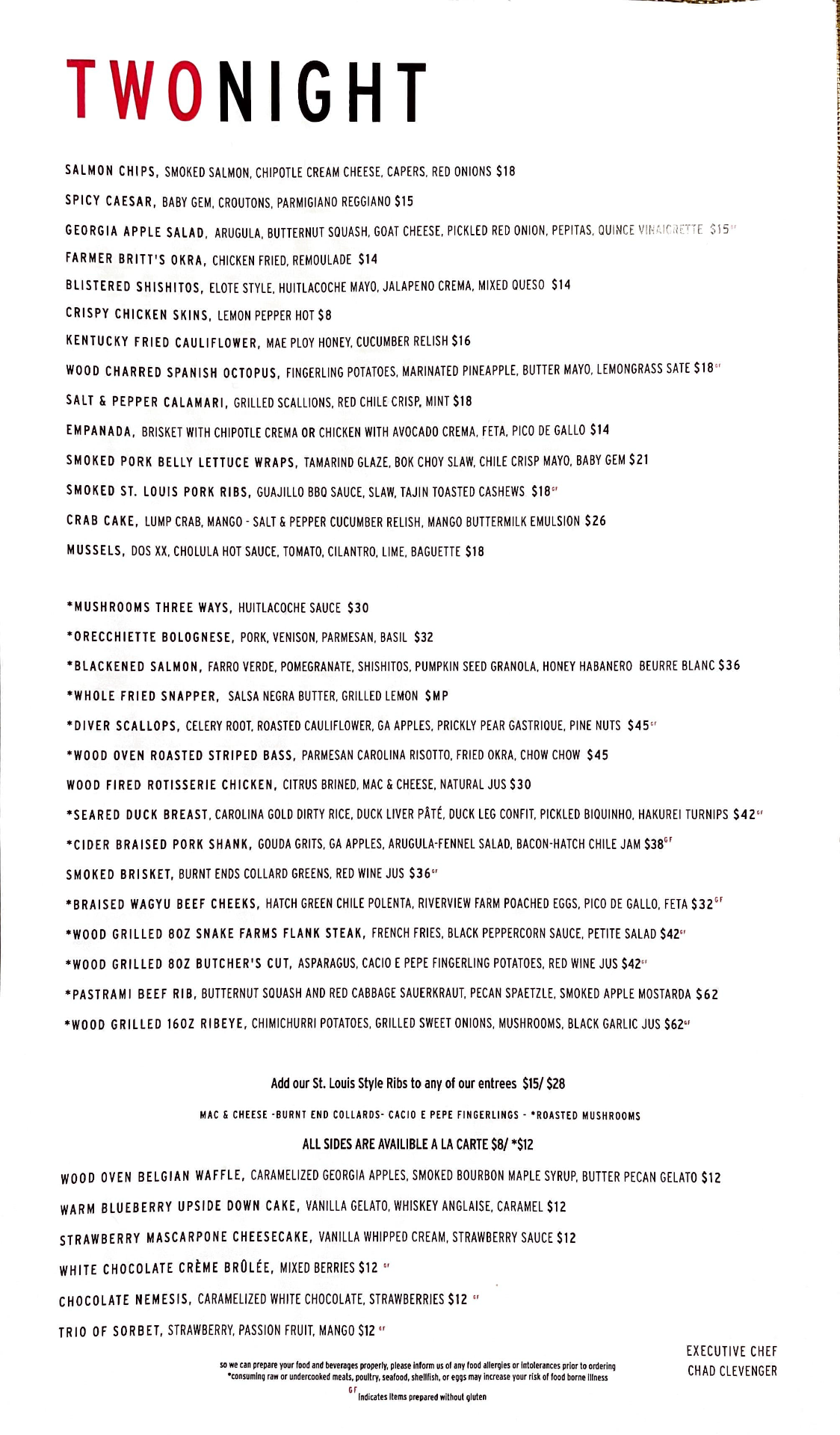
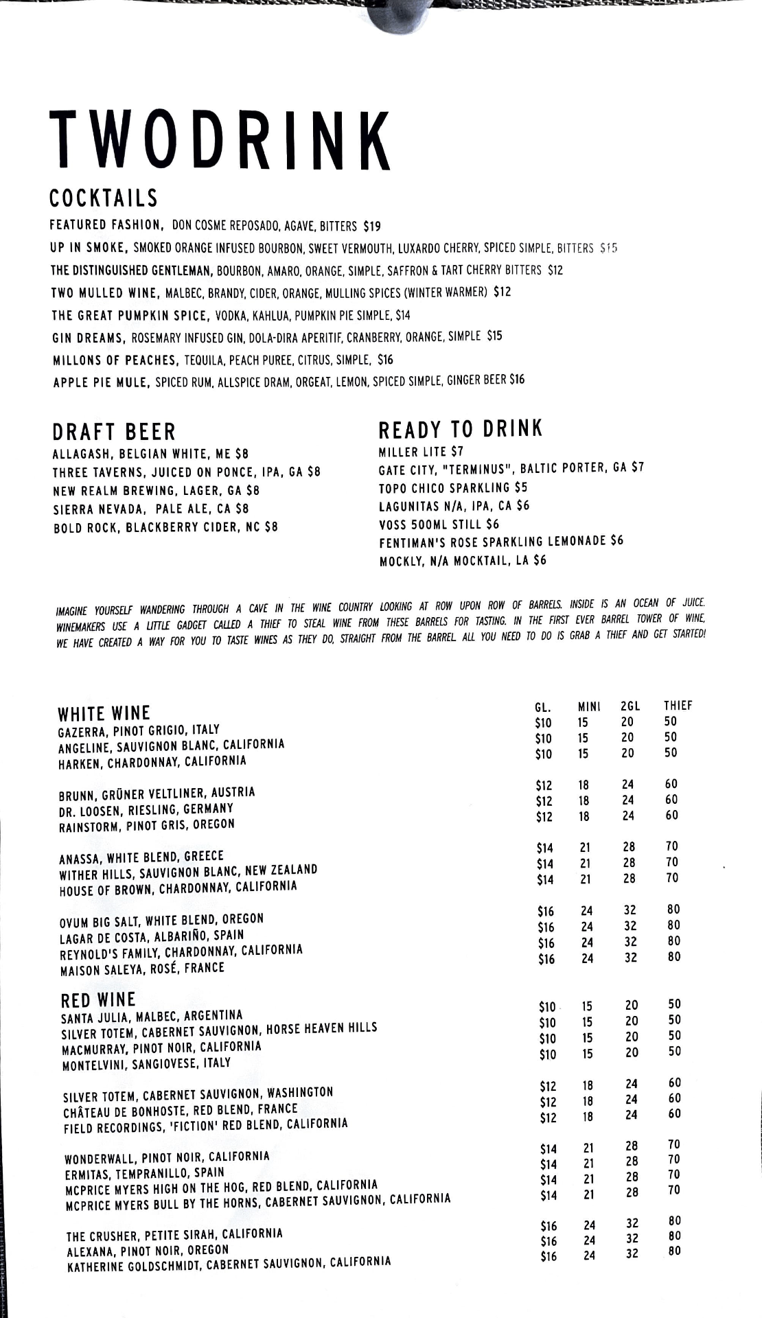
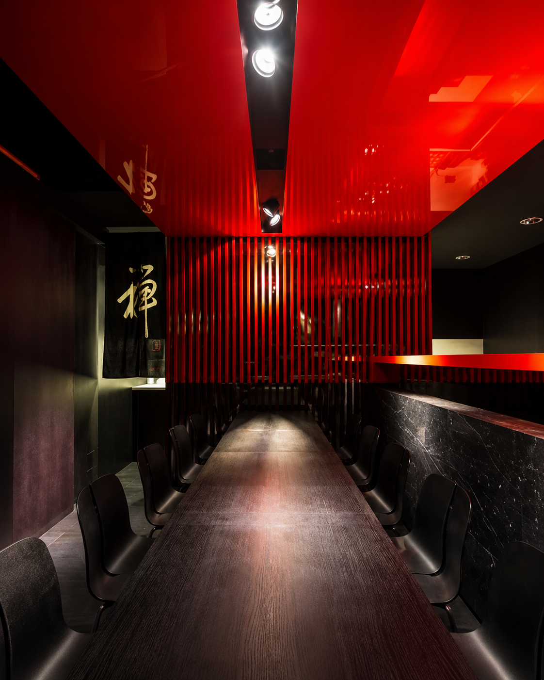
Before touching the brand, I spent time in the room, on the menu, and with the people the restaurant is actually built for. Four visits, a full menu read, competitor walks along the BeltLine, and an audience profile of who's actually at the table.
Bold, wood-fired, BeltLine-born.
Two Urban Licks is a trendy, industrial-style restaurant on Atlanta's East BeltLine, known for bold wood-fired dishes and a vibrant atmosphere. The space mixes indoor and outdoor seating, a patio, and a bocce court. The menu is Southern-inspired American — creative cocktails, wine on tap — a go-to for casual nights out and special occasions alike.
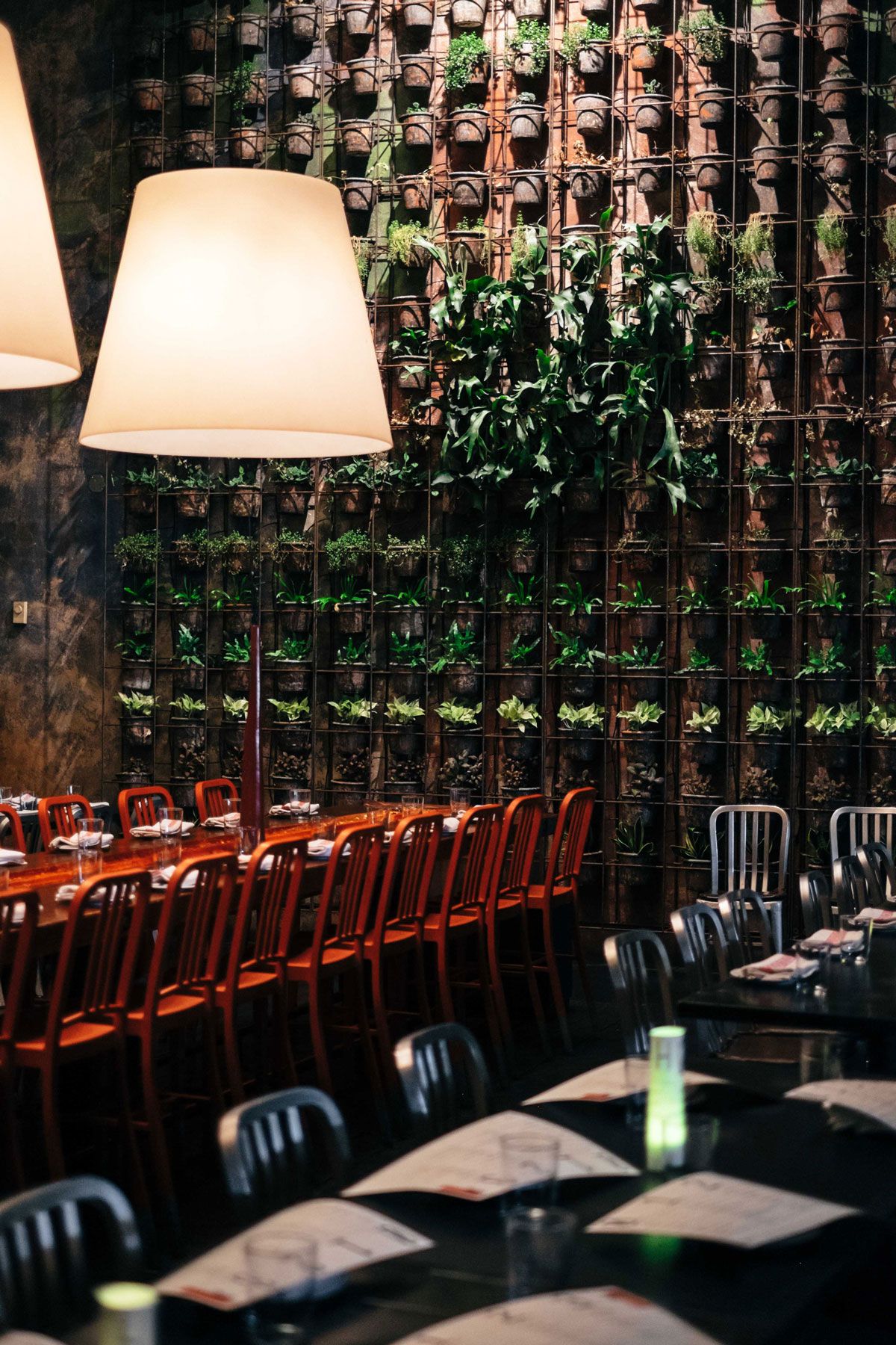
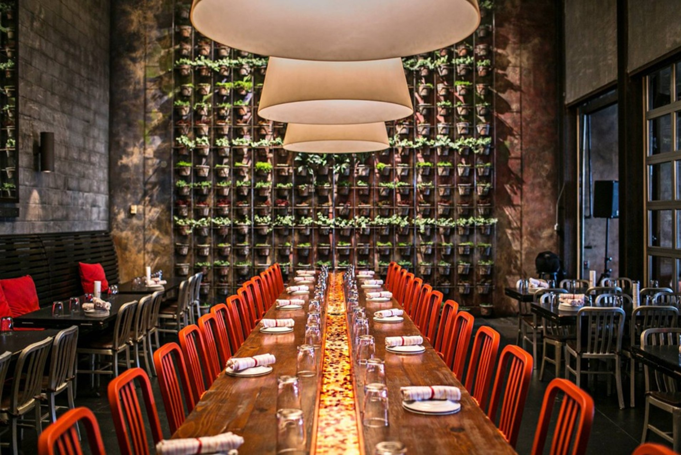
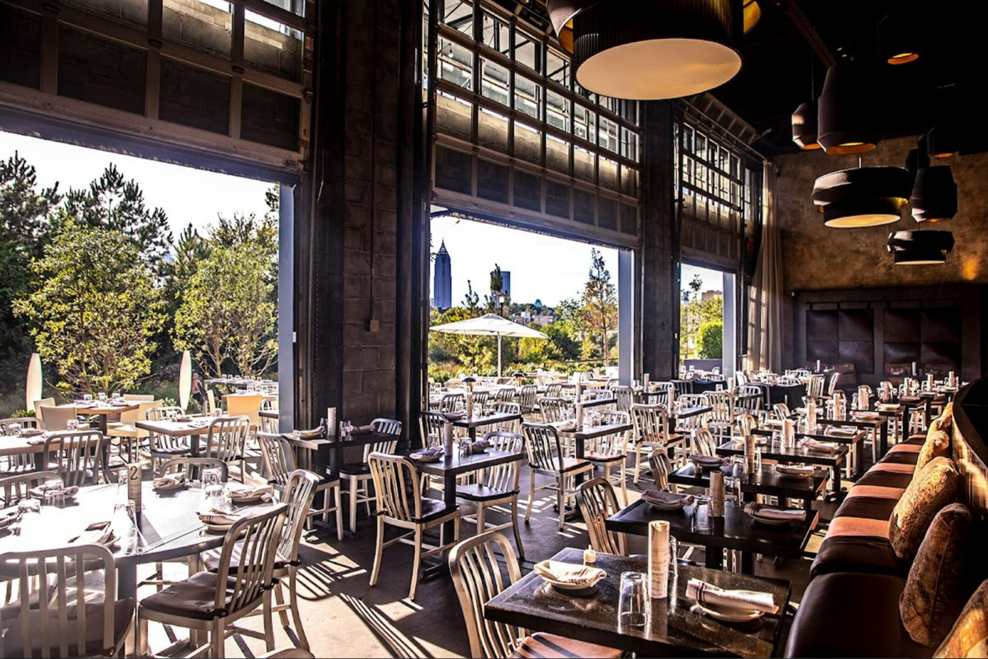
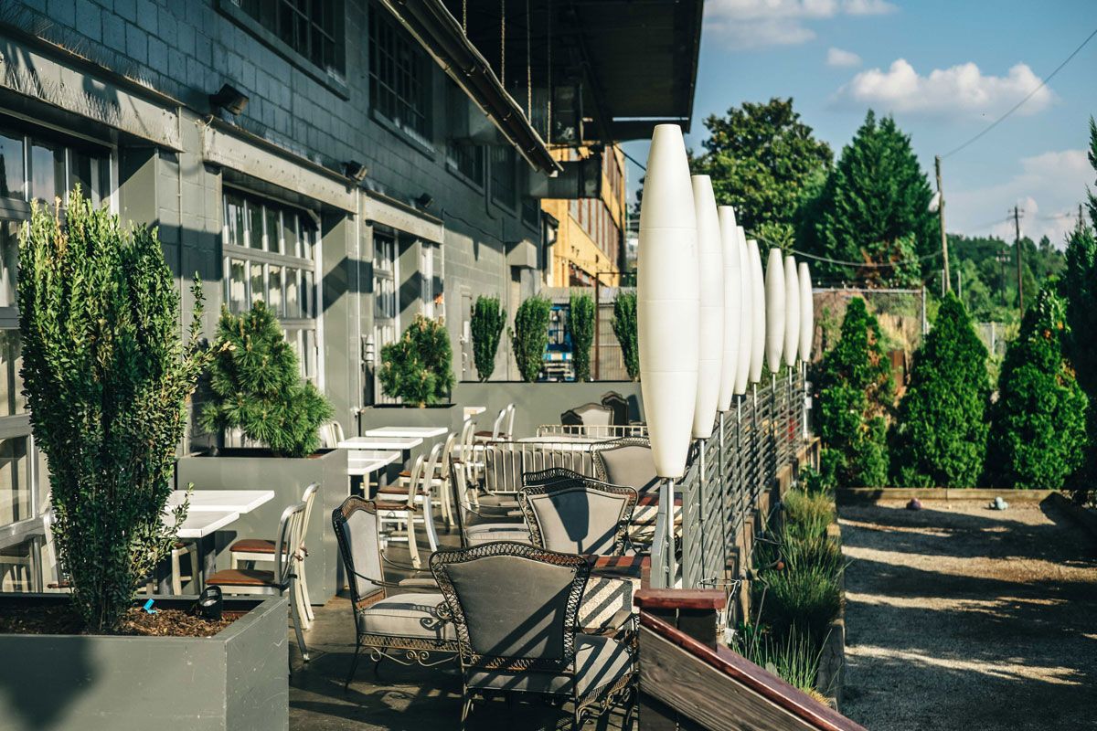
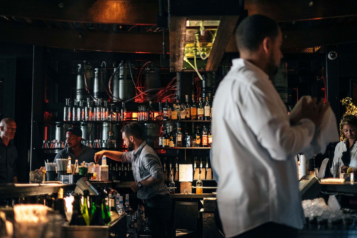
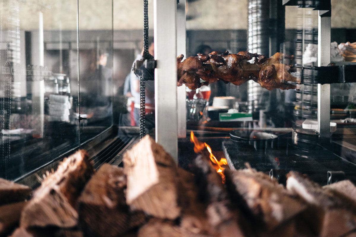
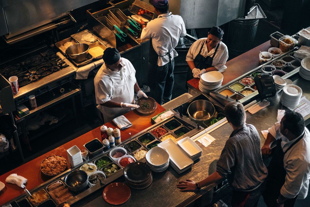
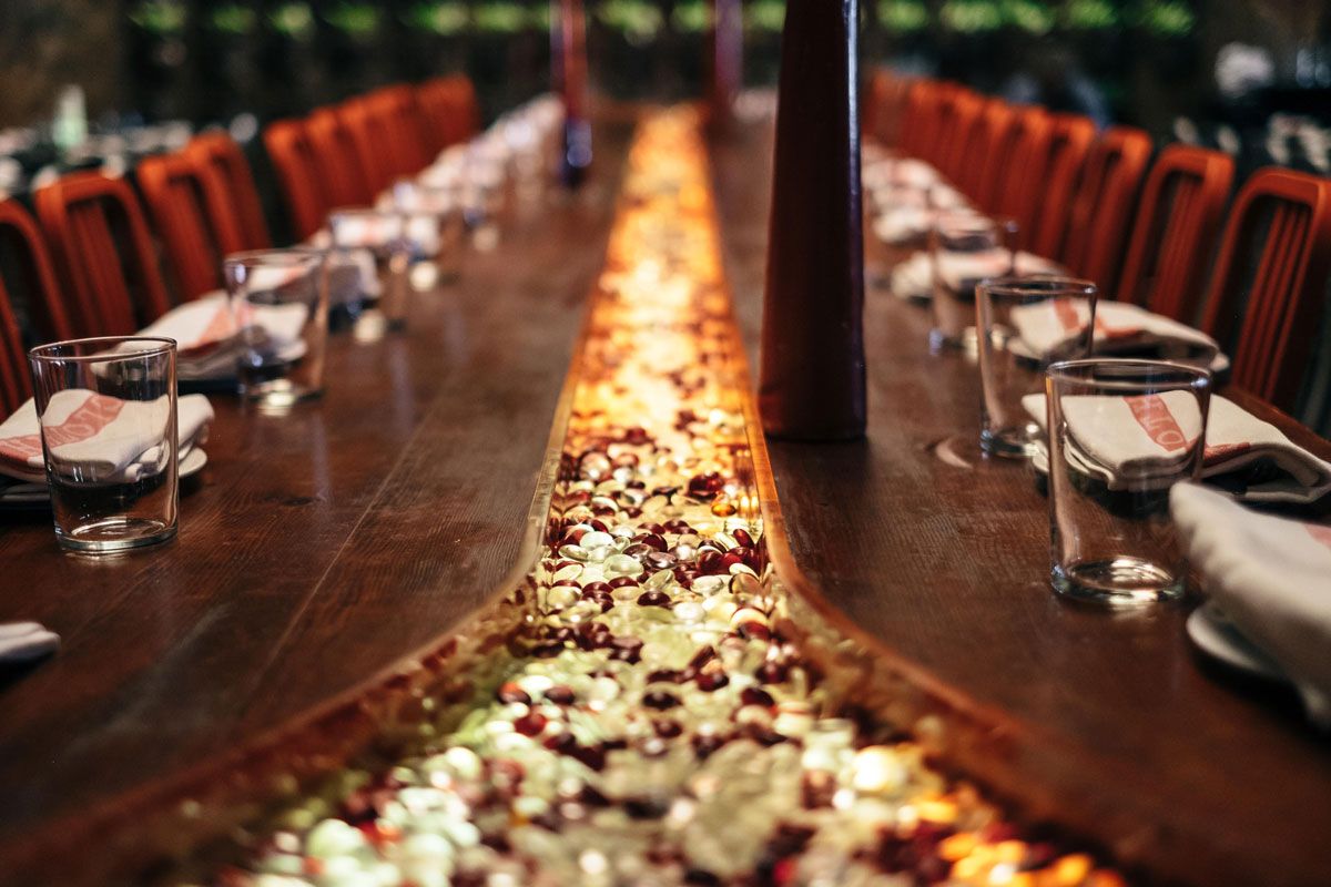
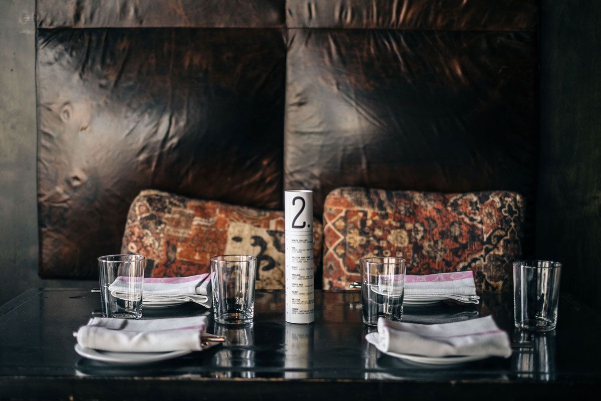
A Southern twist, cooked over fire.
The menu centers on wood-fired cooking and shareable plates — the four pillars that define the dining experience are appetizers, mains, drinks, and dessert.
A bold kitchen wrapped in a quiet brand.
The food, the room and the BeltLine context are loud, artistic and fiery. The current identity isn't. The mark, the menu and the touchpoints read minimal and generic — they don't carry the heat of the kitchen into the guest's hand or onto the street. The gap between the experience and the brand is the entire reason a rebrand exists.
The current wordmark is restrained and typographic — it sits beside wood-fired grills, neon and a living plant wall without ever feeling part of them. Bold flavors deserve a bold mark.
A flat printed menu — no dish photography, weak hierarchy, hard to update — at a $30–$62 entrée price point where guests expect the brand to deliver on a "worth it" promise on every surface.
Ladybird owns "backyard." Rathbun owns "classic." No one nearby owns artistic, urban and fiery — the exact territory Two Urban Licks already lives in, but isn't visually claiming.
The brand has to stretch across two very different guests — 25–40 urban foodies coming for an energetic, postable night, and 50+ fine-dining patrons celebrating an occasion. The current identity is too soft for the first and too anonymous for the second.
Exterior signage, interior wayfinding, tableware, uniforms, advertising and the in-room menu all need to carry the same fiery, confident voice. Today they don't — each surface is doing its own thing, and the brand never compounds.
Two Urban Licks sits directly on the Eastside BeltLine — millions of pedestrians, runners and cyclists pass within feet of the door every year — yet there's no trail-facing signage or landmark. People literally can't find the restaurant from the path they're already on. A massive walk-up audience is being missed because the brand never extends to the trail.
While TWO Urban Licks sits directly along the Atlanta BeltLine, much of its visibility and signage is oriented toward street arrivals. The opportunity was to create a stronger BeltLine presence while modernizing the brand and improving guest navigation
Urban · Fiery · Artistic
Brainstorming pulled eight words from the research. Three rose to the top — and became the lens for every visual decision that followed.
- ✓Artistic
- ✓Urban
- —Industrial
- —Vibrant
- —Experimental
- —Dynamic
- ✓Fiery
- —Lively
These three words framed everything that came next — palette, typography, the Picasso-edge mark and the editorial tone of the system. "Industrial" stayed as texture, while "Vibrant" carries through the palette and copy as a supporting accent.
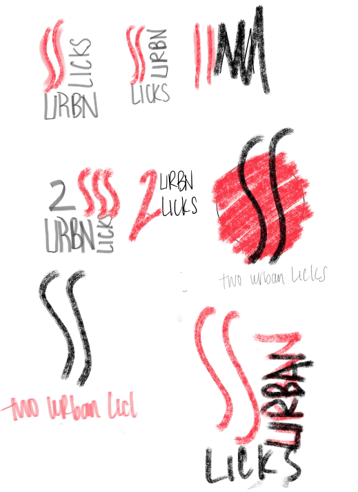
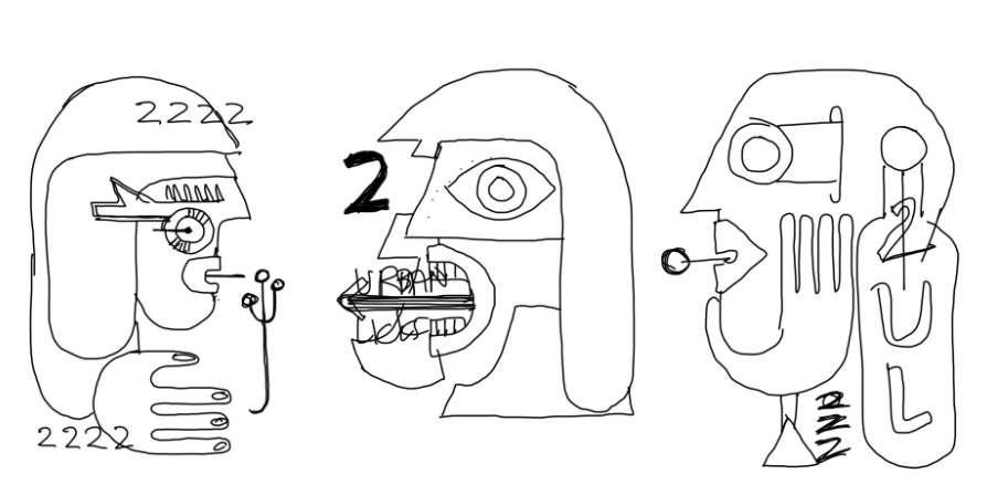
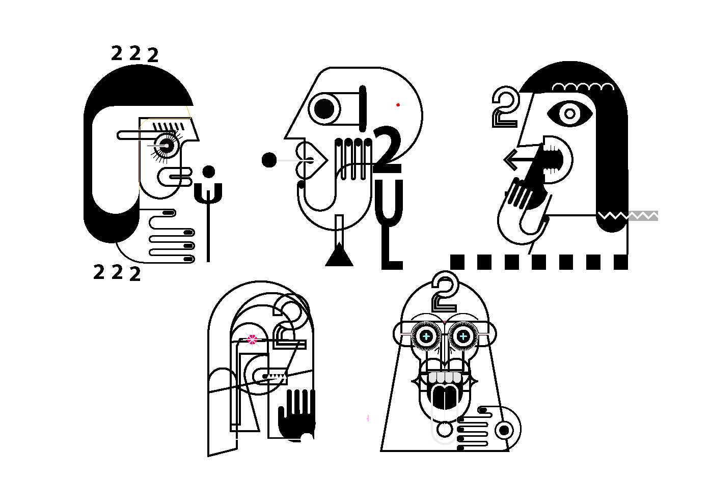
A face, a fire, a 2.
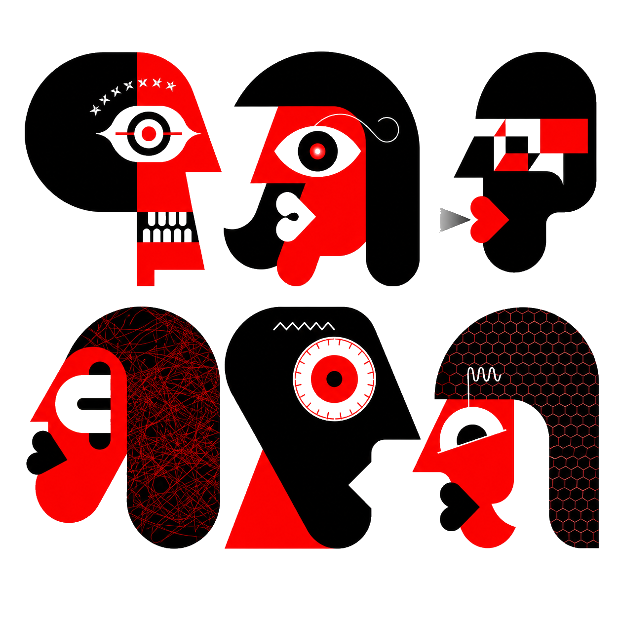
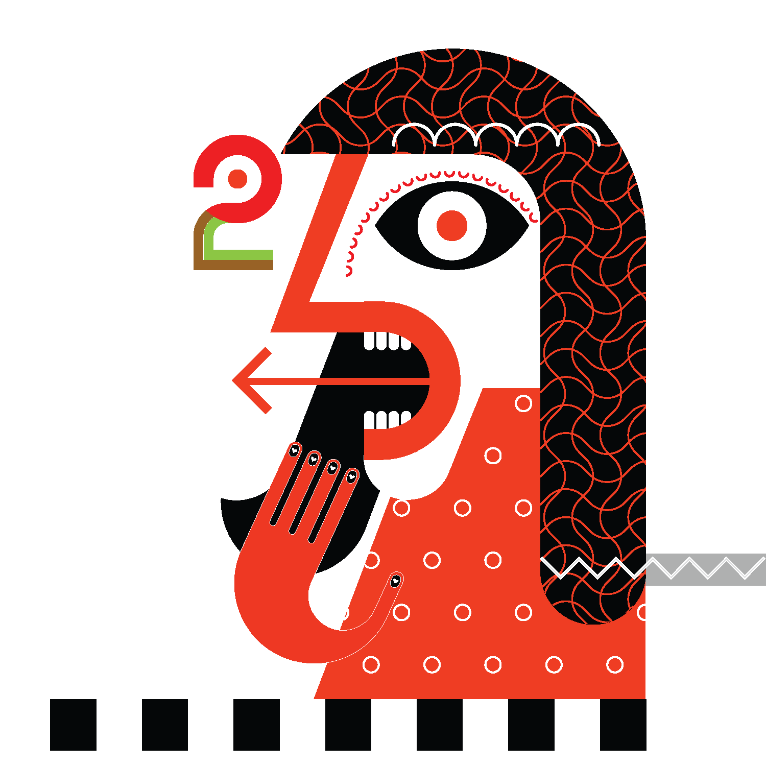
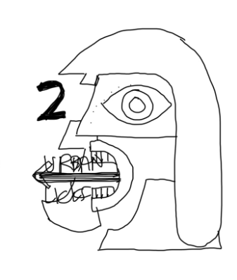
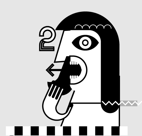
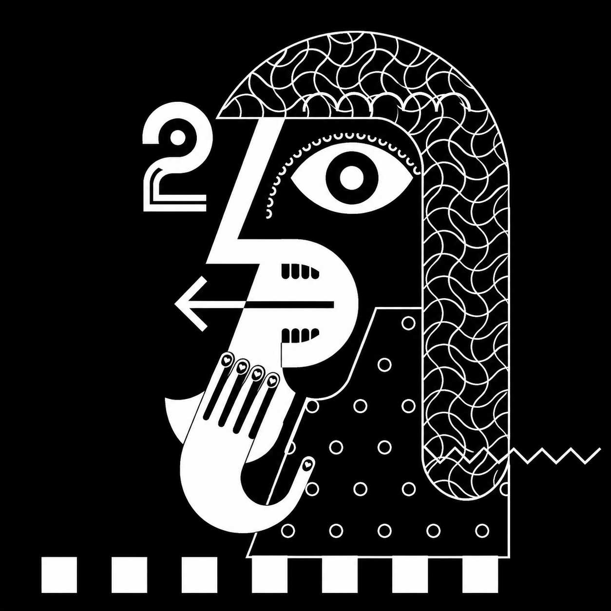
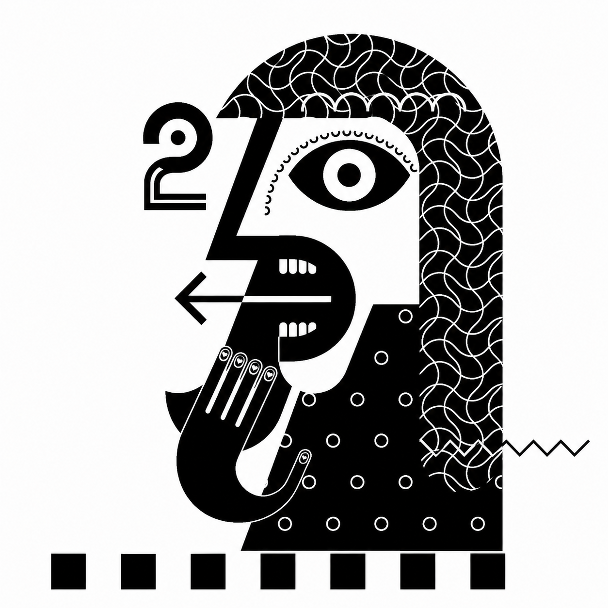
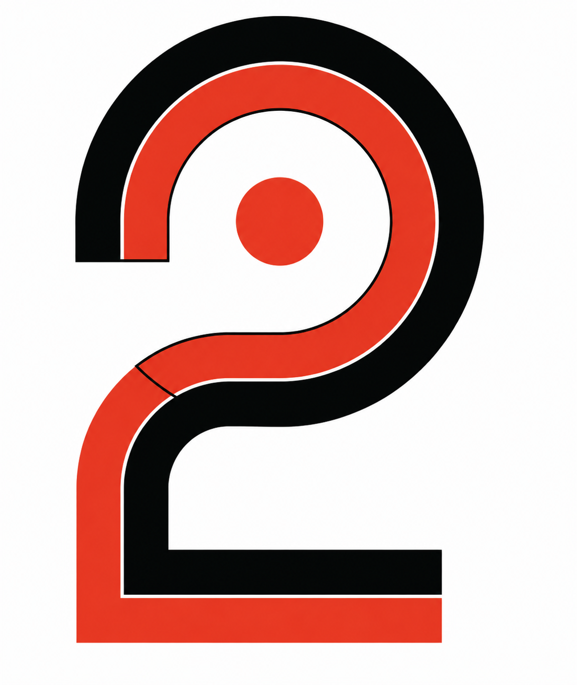
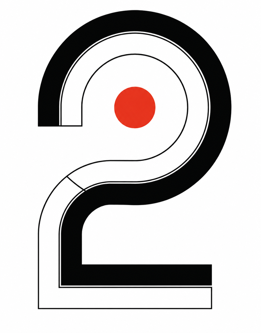
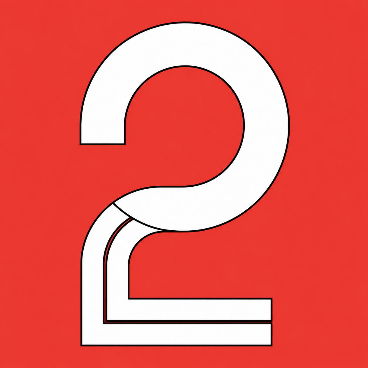
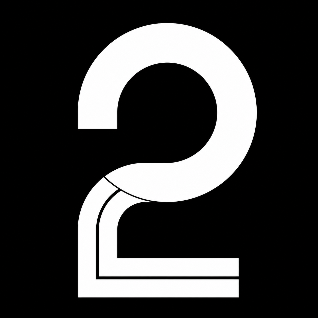
The mark balances a Picasso-like abstract face with the prominent numeral 2 — a direct nod to the name and a literal reference to the open mouth and tongue that evoke flavor and fire.
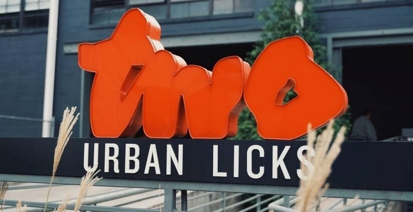
Design rationale
The prominent '2' reinforces the name with modern, clean geometry.
Picasso-inspired abstraction signals urban creativity and sophistication.
Open mouth and tongue-like forms evoke flavor — central to the menu.
Clean lines and bold contrast mirror the industrial, city-centric ambience.
A palette built for contrast.
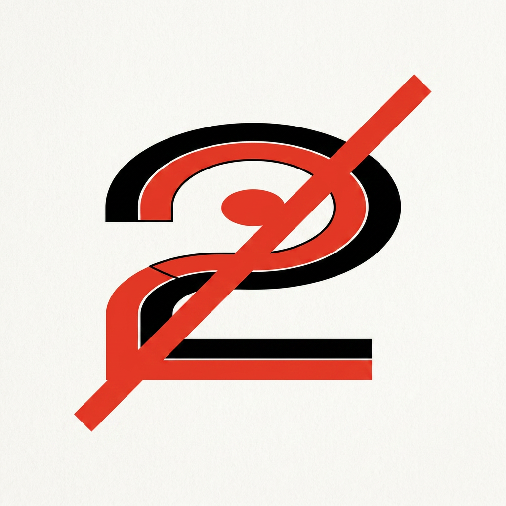
Space Cadet anchors the system with confidence; Fire Engine Red ignites every interaction. Coal Grey and Auto-Flash White provide breathing room and editorial calm.
Logo · Headlines · Signage · Campaigns
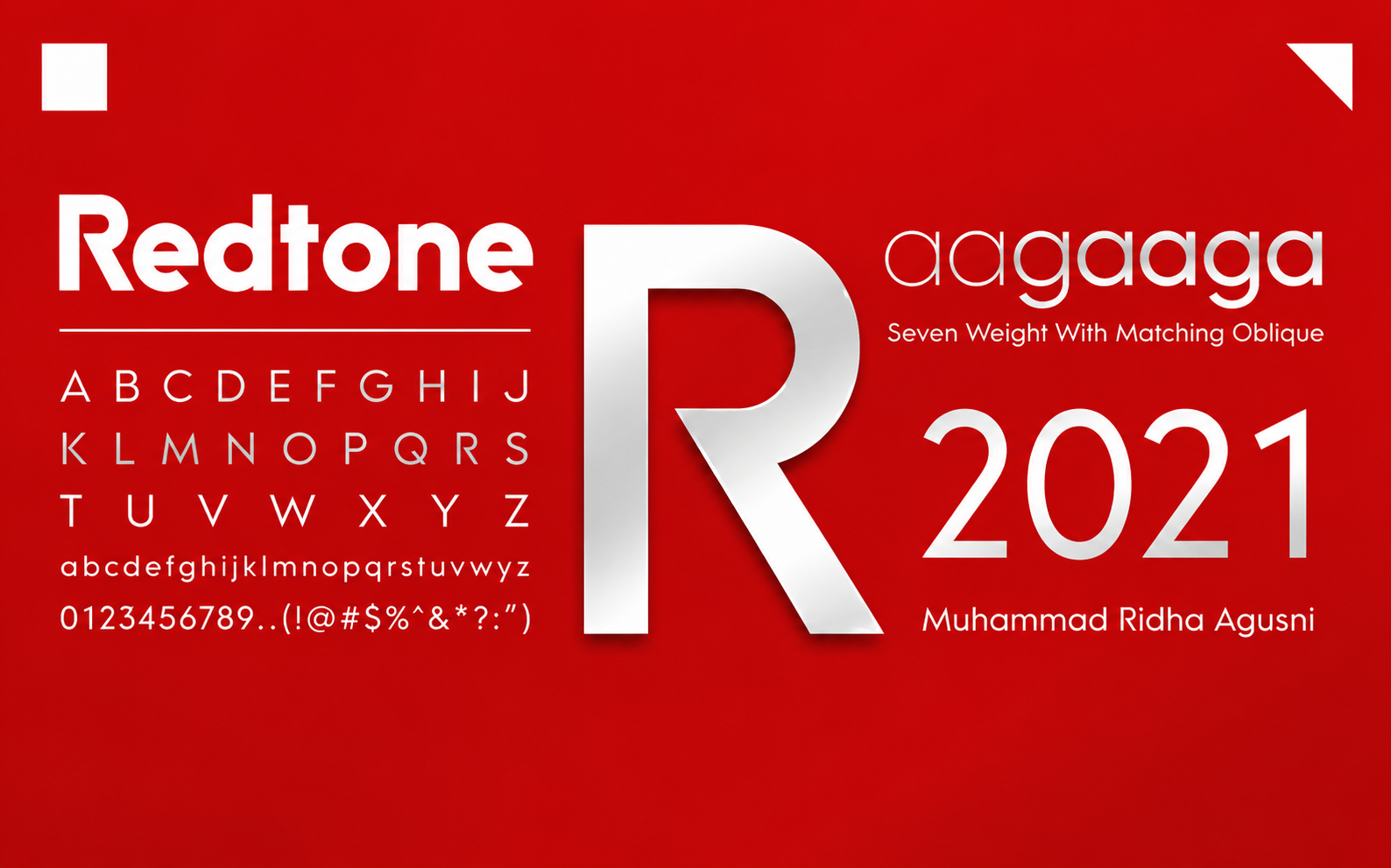
Used for the logo, headlines, signage, and key brand moments. Redtone brings warmth, personality, and a bold culinary presence to the identity.
ABCDEFGHIJKLMNOPQRSTUVWXYZ
abcdefghijklmnopqrstuvwxyz
1234567890&*@?!/+()#®©
Menus · Body Copy · Wayfinding · Digital Content
Used for menus, descriptions, wayfinding, and long-form content. Hyogo balances the expressive display type with clarity and readability across guest touchpoints.
ABCDEFGHIJKLMNOPQRSTUVWXYZ
abcdefghijklmnopqrstuvwxyz
1234567890&*@?!/+()#®©
From business cards to chef coats.
Every surface the brand touches — stationery, tableware, uniform, signage, take-out. The mark was stress-tested across scale, material and context.
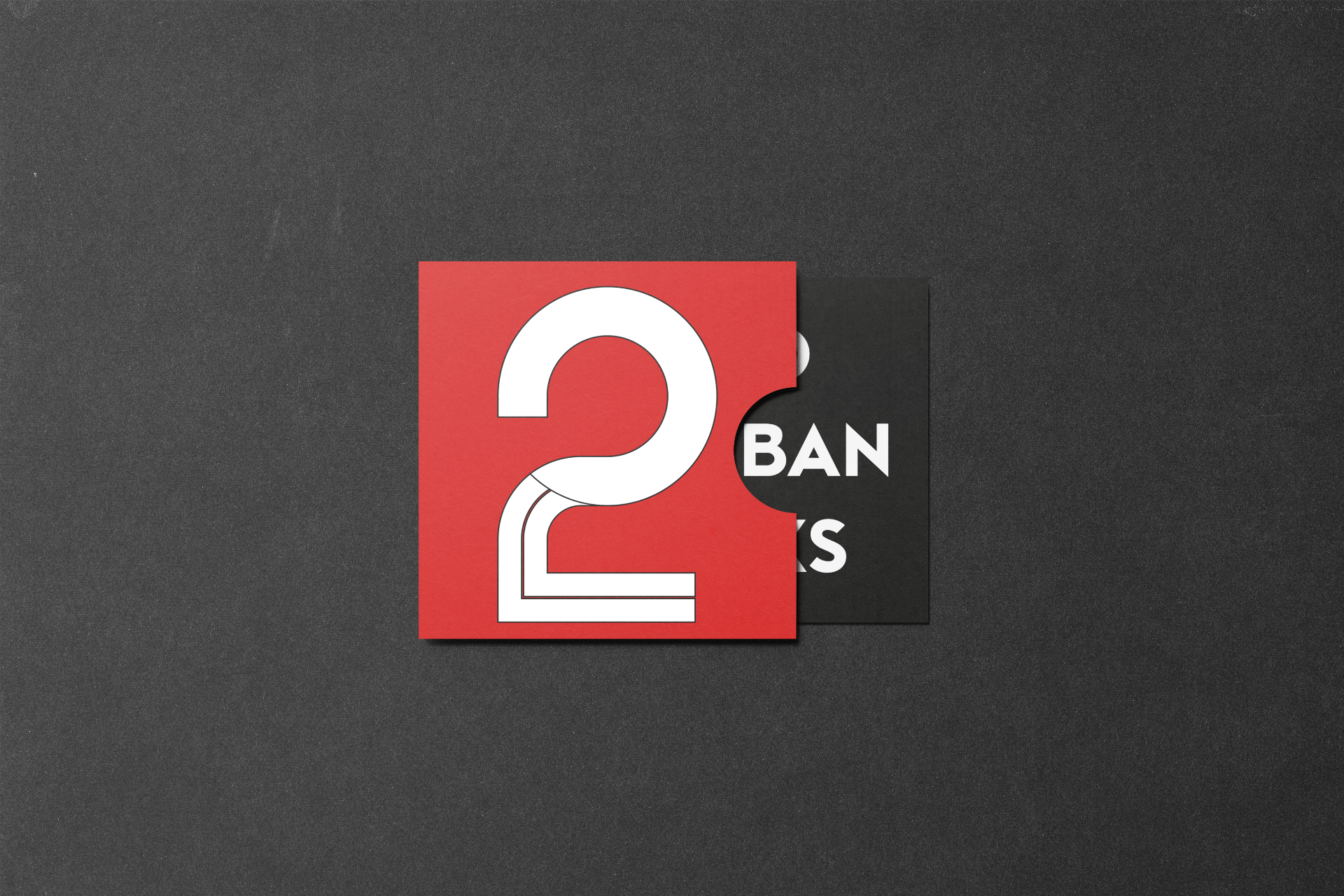
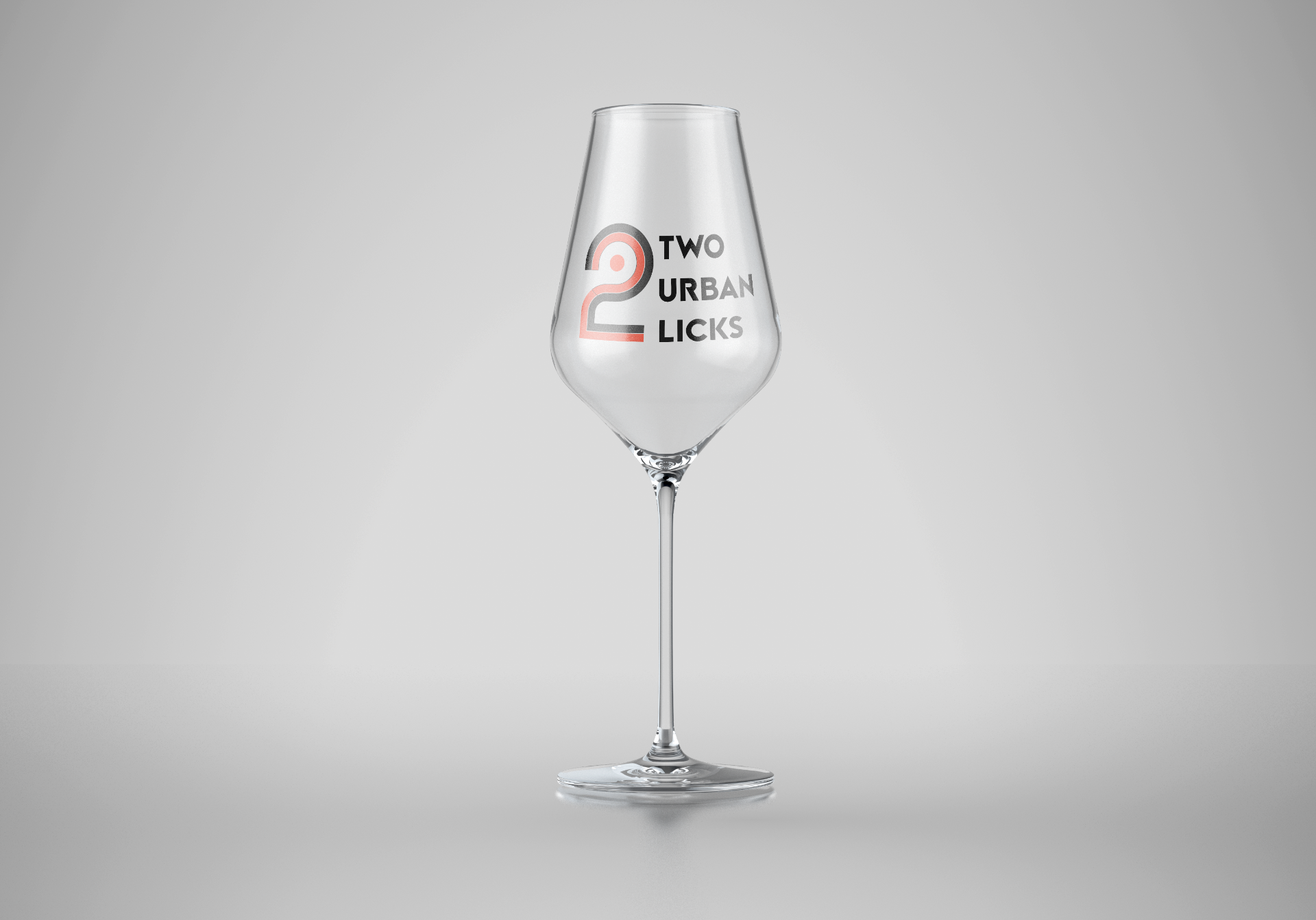
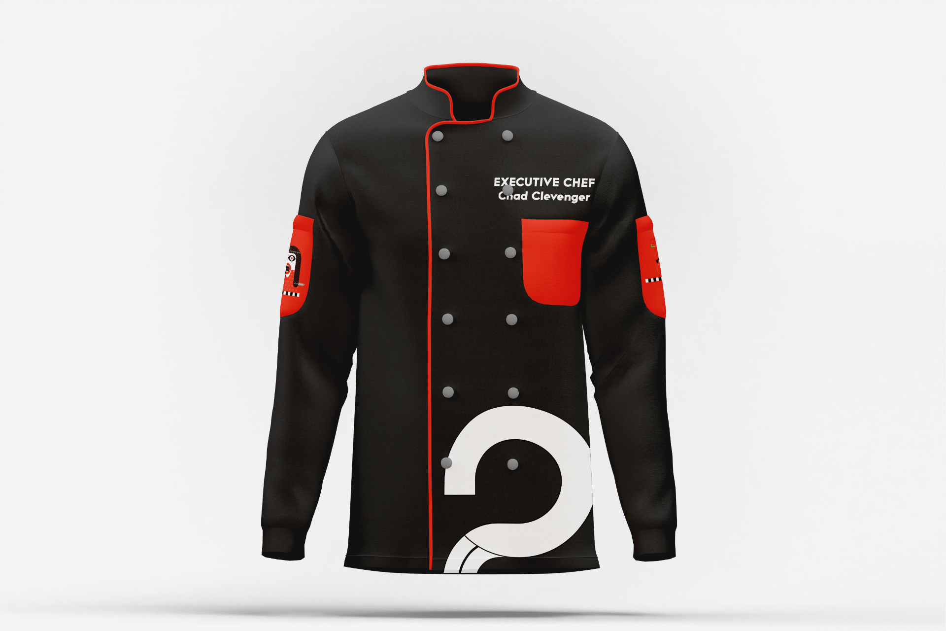
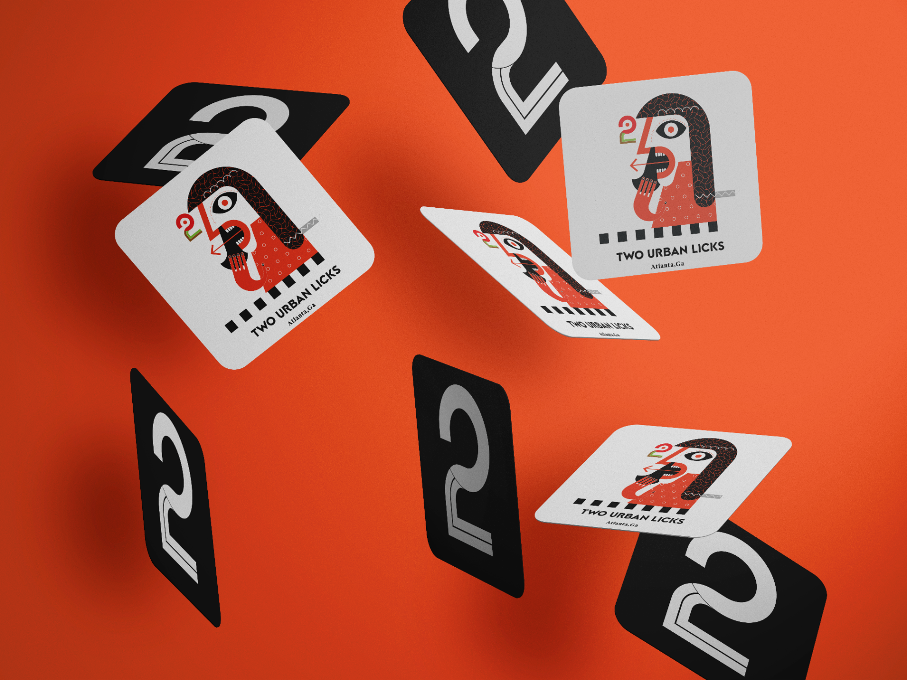
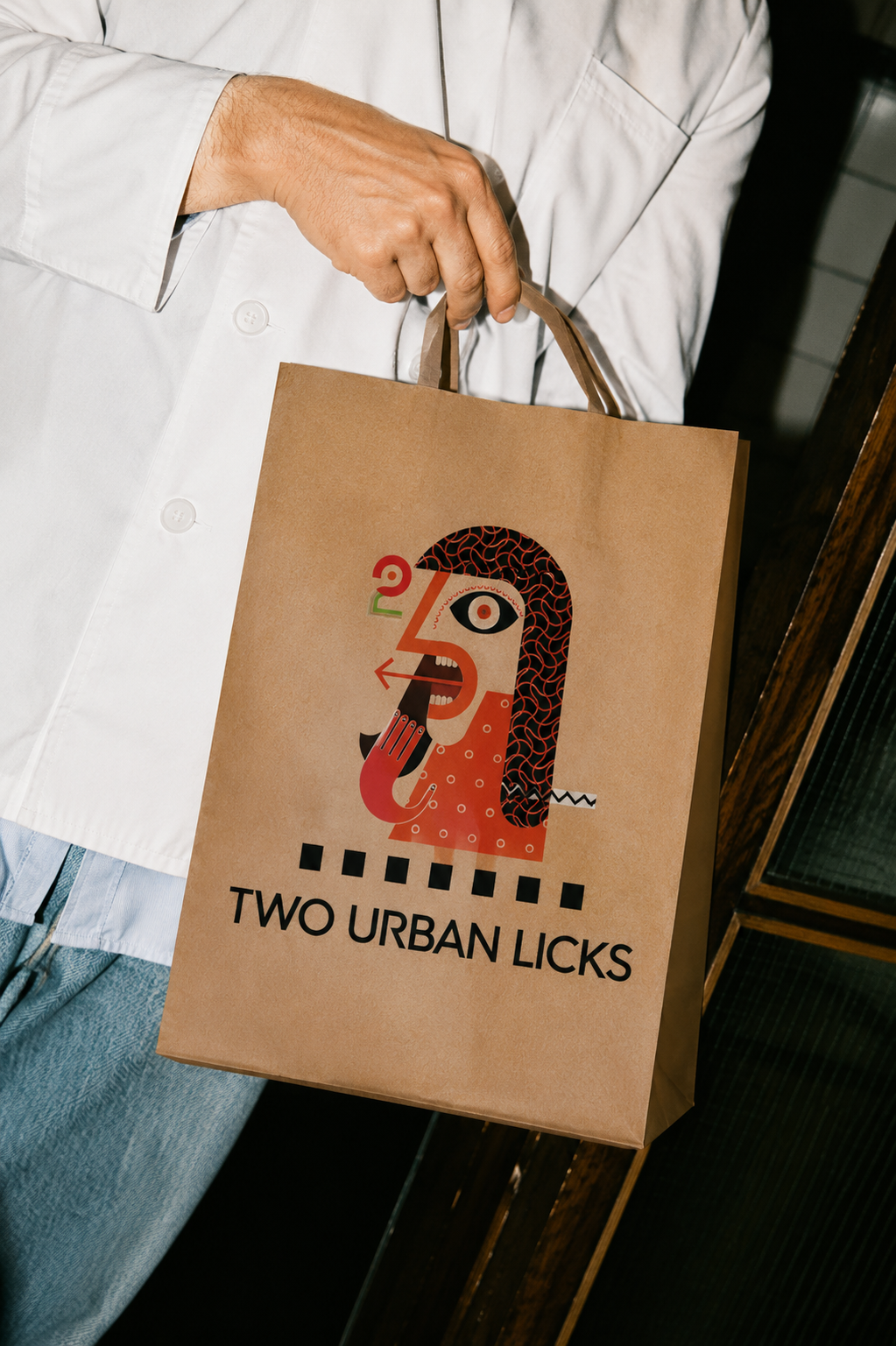
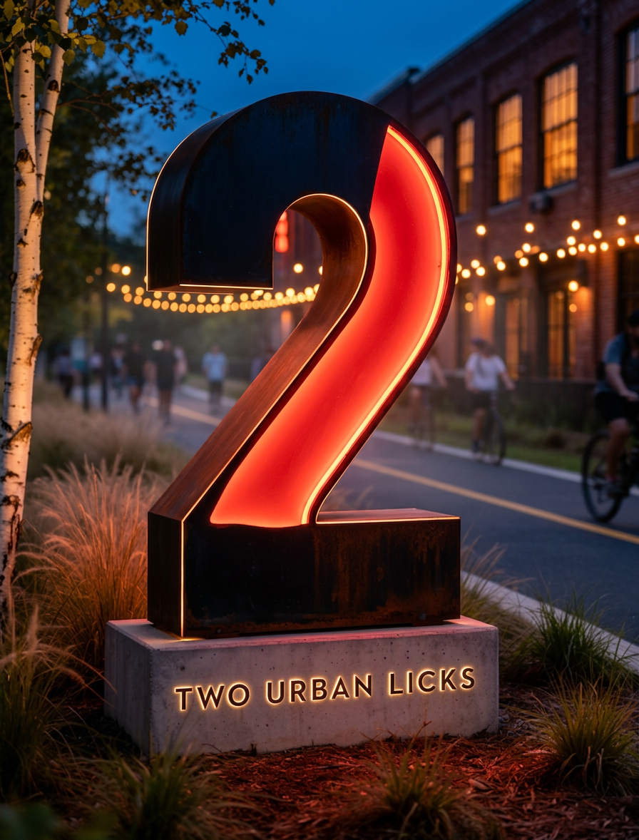
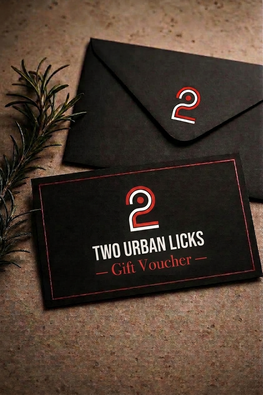
"A brand isn't a logo. It's everywhere the logo isn't."
The hit list defined every touchpoint the rebrand needed to cover — print collateral, tableware, uniform, environmental signage and retail goods — so each application reinforced the same fiery, confident voice.
The brand in place.
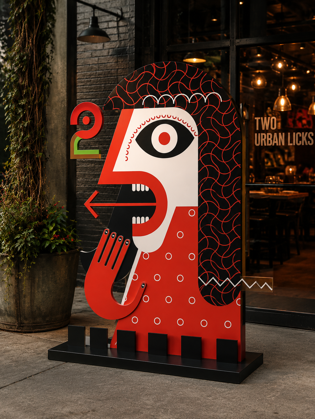
Exterior signage, interior wayfinding and an architectural concept that places the mark in conversation with wood, glass and Atlanta greenery.
Turning the "2" into a landmark on the trail.
Two Urban Licks sits directly on the Atlanta BeltLine, but its primary signage faces the street and parking lot. Pedestrians, runners and cyclists pass within feet of the door without ever seeing it. The arrival experience extends the mark off the building and onto the trail — a series of illuminated sculptural "2"s that double as wayfinding and public art.
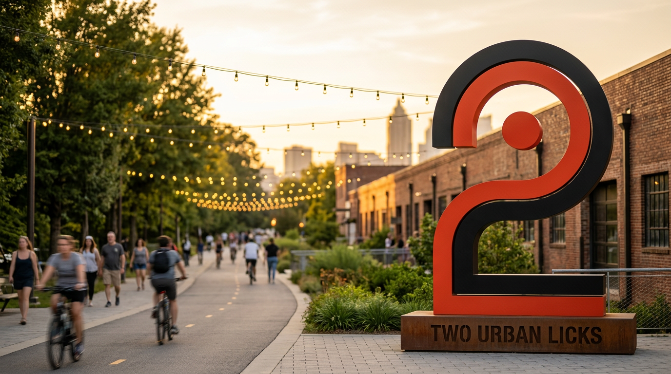
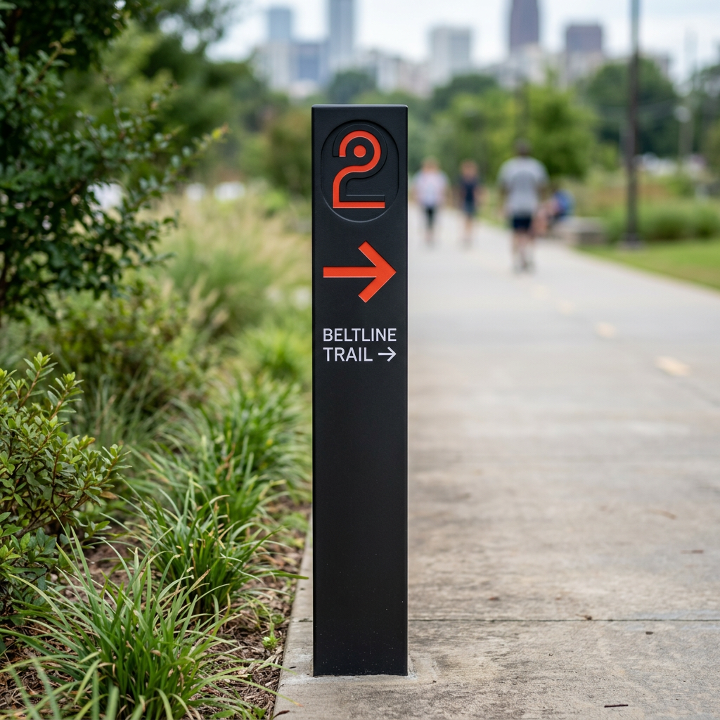
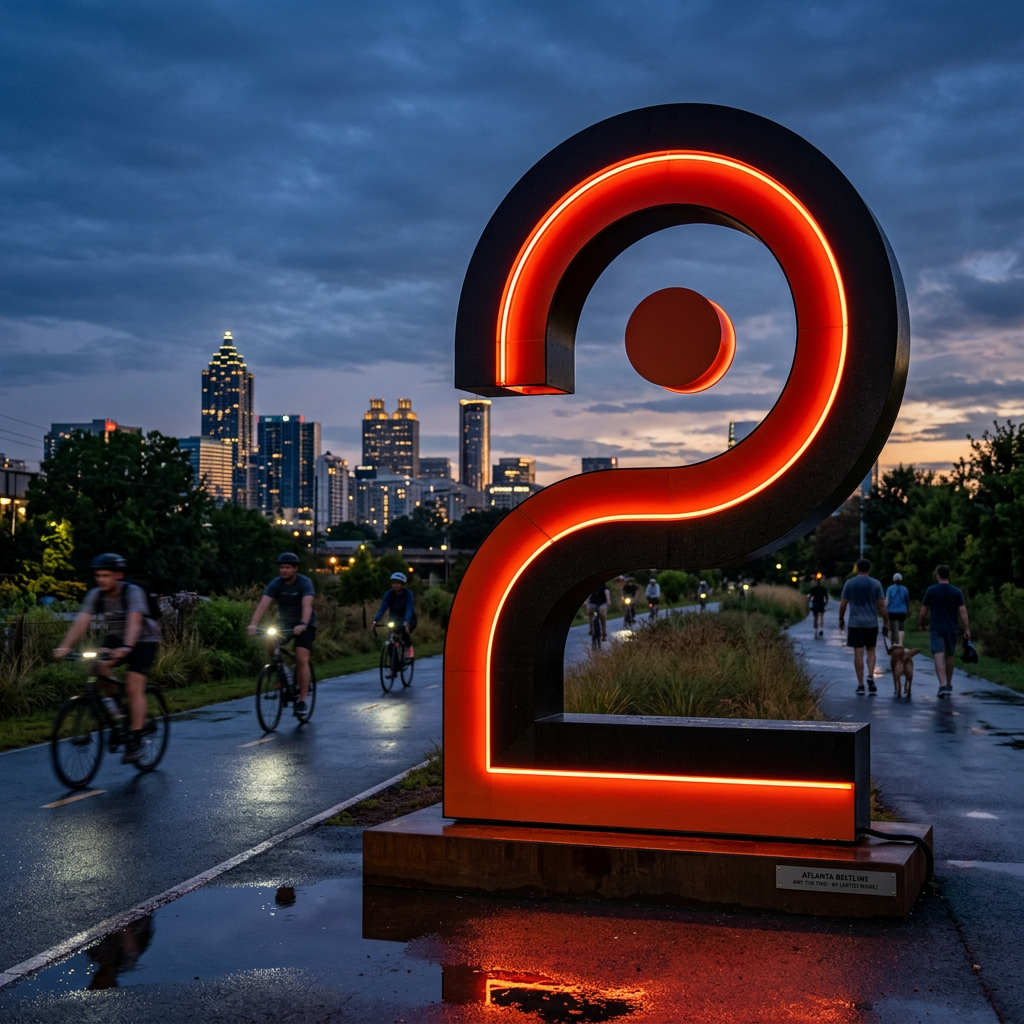
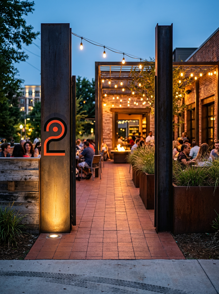
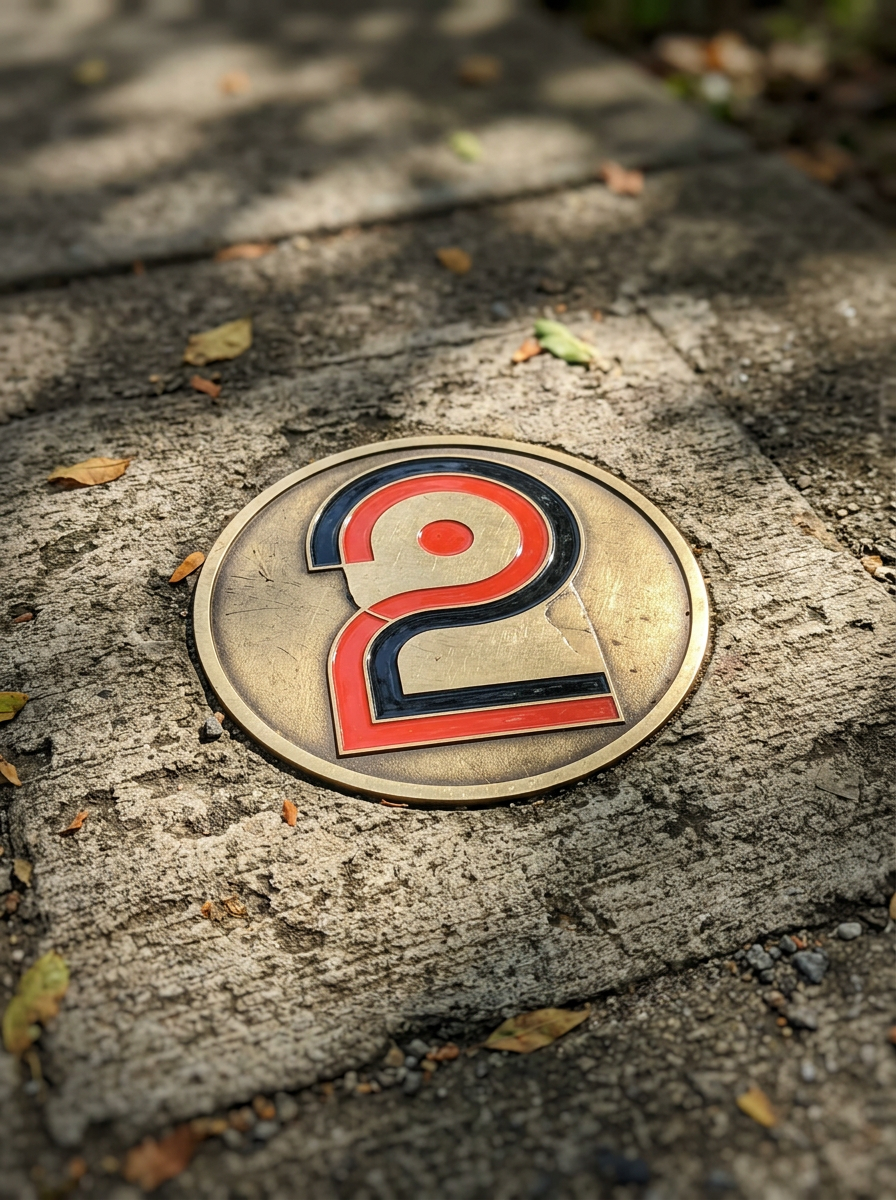
- — Large-scale illuminated "2" landmark visible from the BeltLine
- — Directional wayfinding integrated into the logo form
- — LED lighting tuned for nighttime visibility
- — Public-art-inspired installation that complements the trail
- — Consistent branding from trail arrival to restaurant entrance
- — Improves visibility for the ~2M annual BeltLine users
- — Creates a memorable, photographable arrival moment
- — Strengthens the link between Two Urban Licks and the BeltLine
- — Drives spontaneous visits from pedestrians and cyclists
- — Extends the brand experience beyond the four walls
A flat, flame-forward icon system.
Clean, recognizable icons built around flame, food and drink imagery — designed to work small on the menu tablet and large on environmental wayfinding.
Two stories. One voice.
Two launch campaigns extending the identity into social and event platforms — each tuned to a different audience and moment of the week.
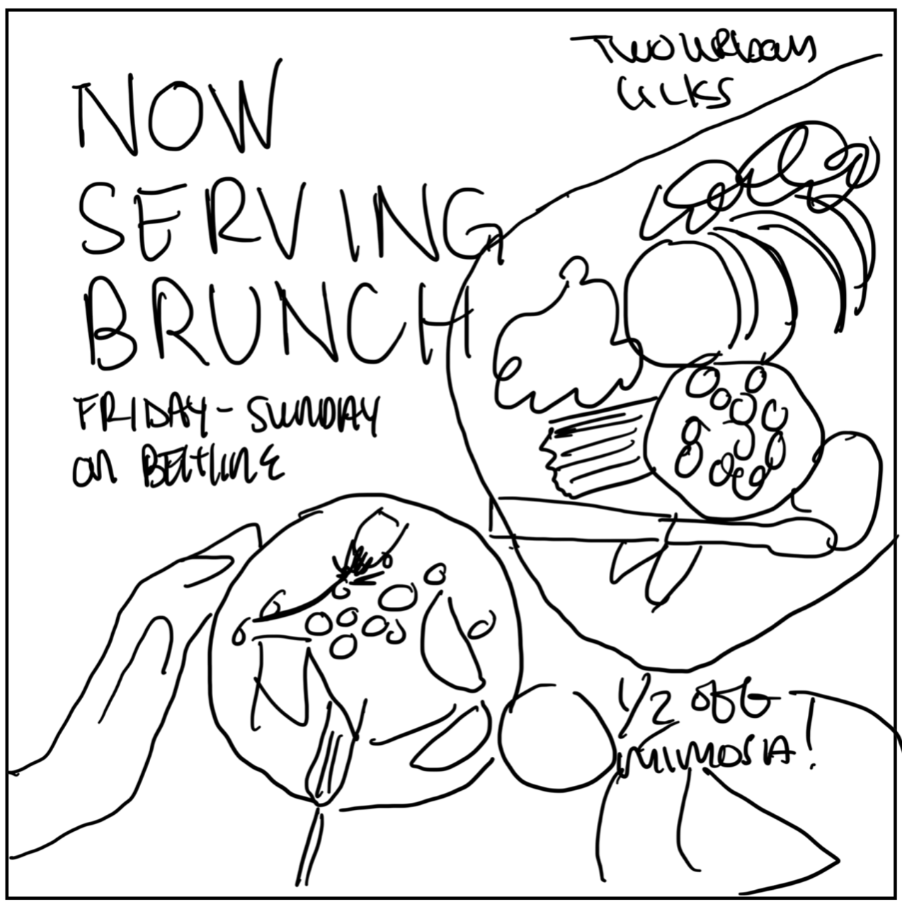
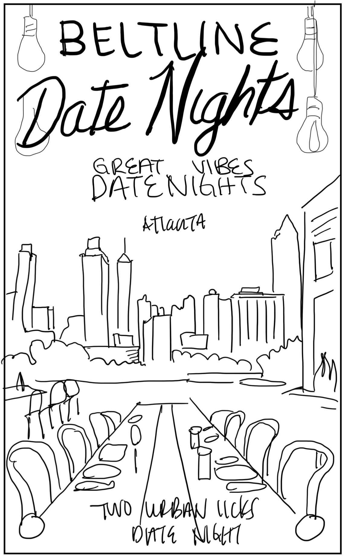
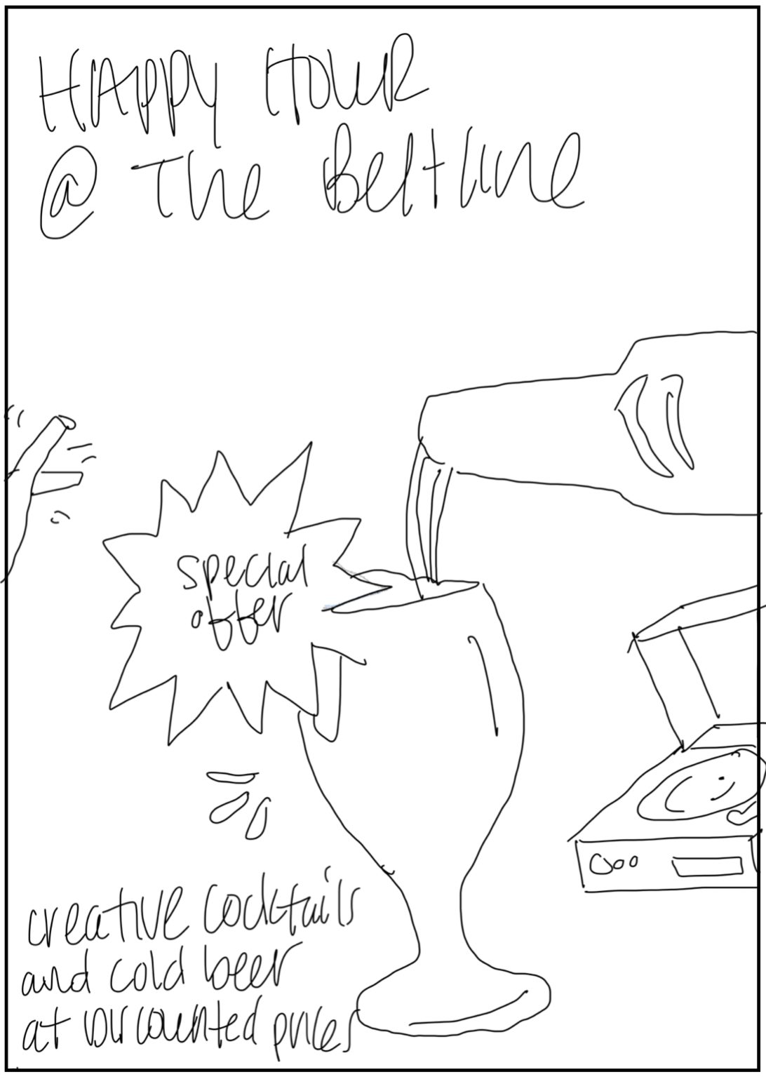
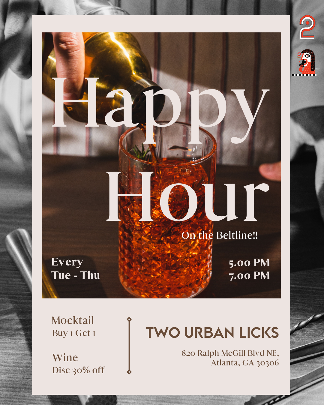
Instagram & Facebook · Beltline frequenters, after-work crowd
Capture the vibrant, social vibe of a post-walk hangout.
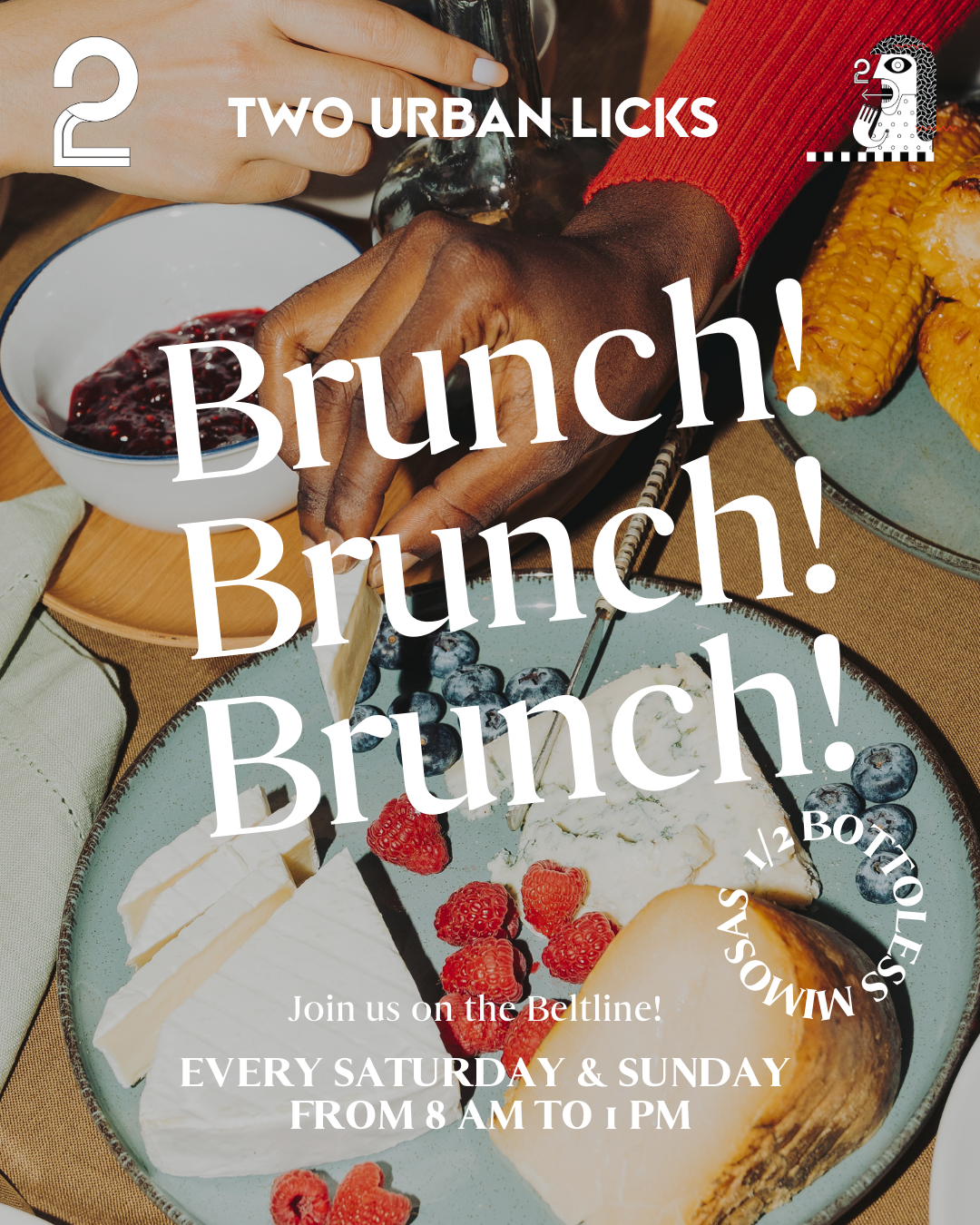
EventBrite, Yelp Events, Google Ads
Attract weekend crowds with an enticing brunch experience.
Identity, in the wild.
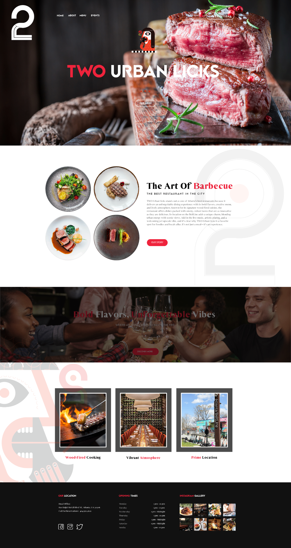
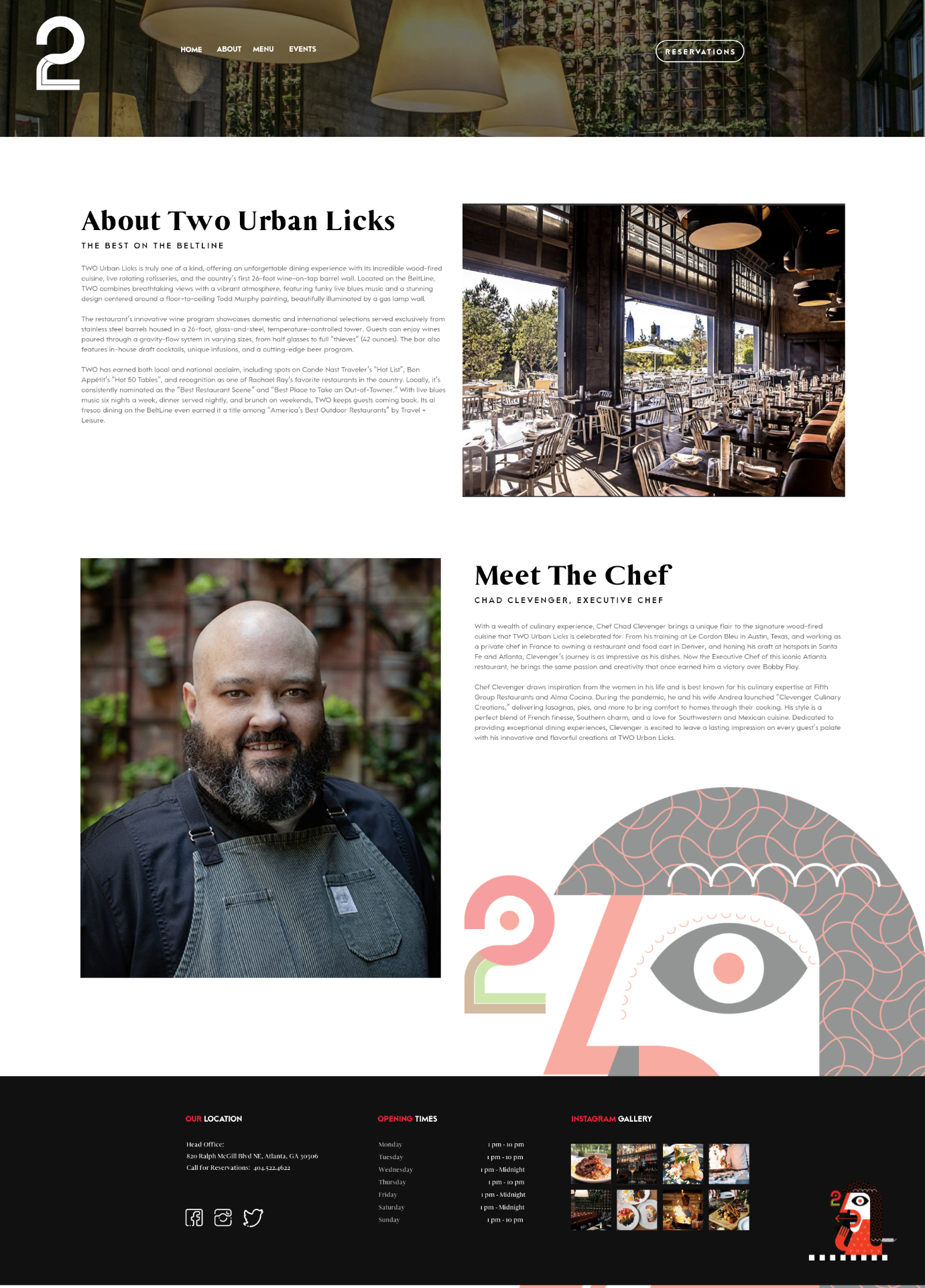
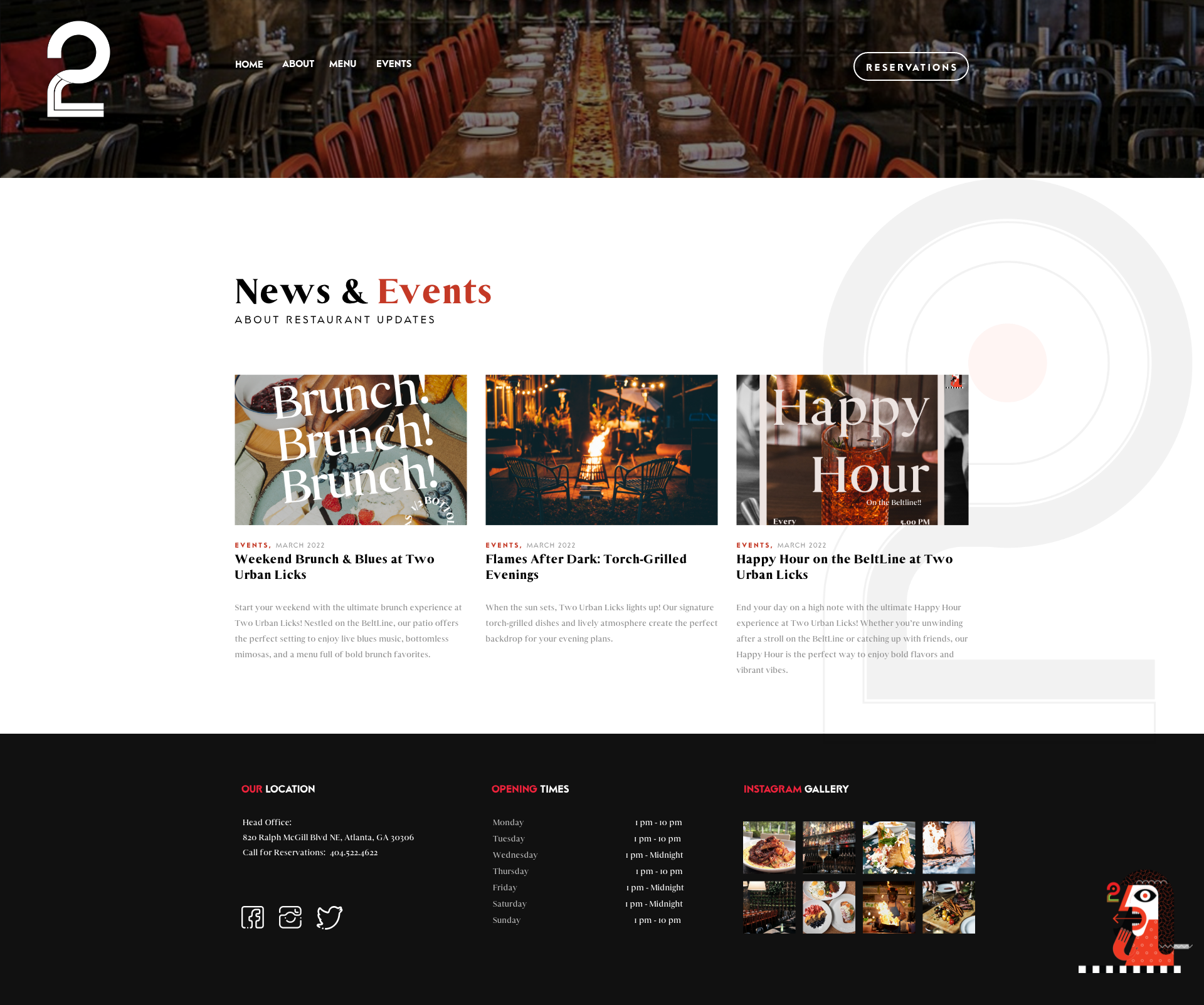
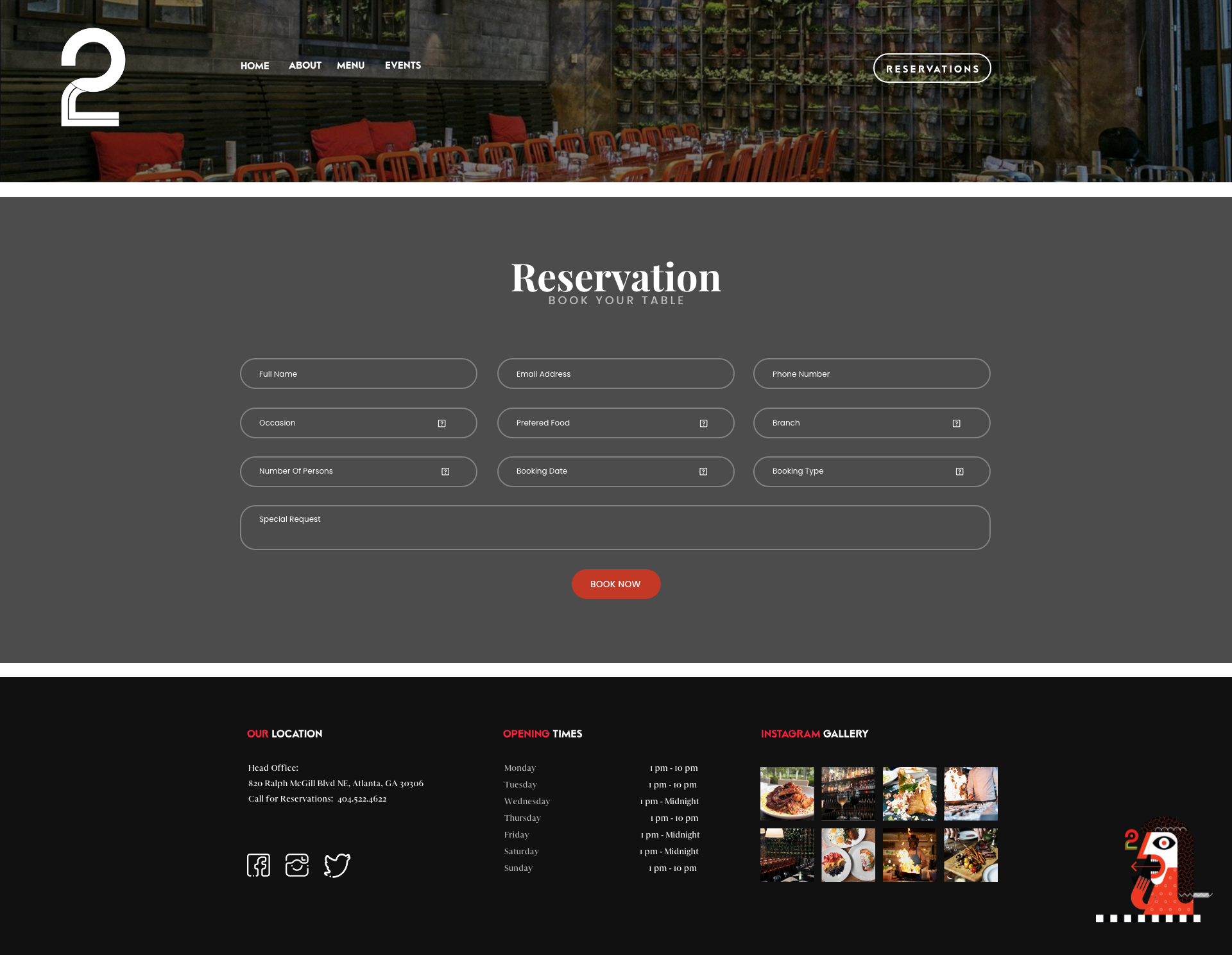
A user-friendly website layout, trail-facing wayfinding, and a tablet-based interactive menu translate the brand into product — the same fiery palette and Picasso mark, now responsive, tappable, and walk-up discoverable.
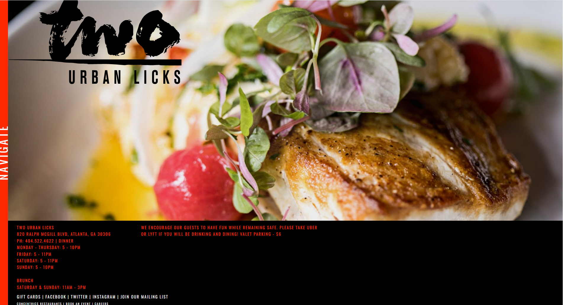
- — Dated typography, weak hierarchy
- — Menu buried 3 clicks deep
- — No mobile-first layout
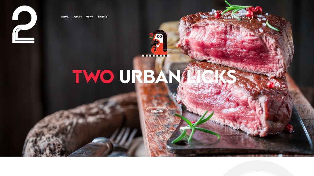
- + Bold editorial hierarchy
- + Reserve & menu in 1 tap
- + Brand-led, fully responsive
Browse categories · Build your order · Takeout or order-ahead dine-in
The TWO Urban Licks tablet menu demonstrates the thought and creativity behind the menu's presentation — bold, innovative, upscale, and built to be tapped, not just read.
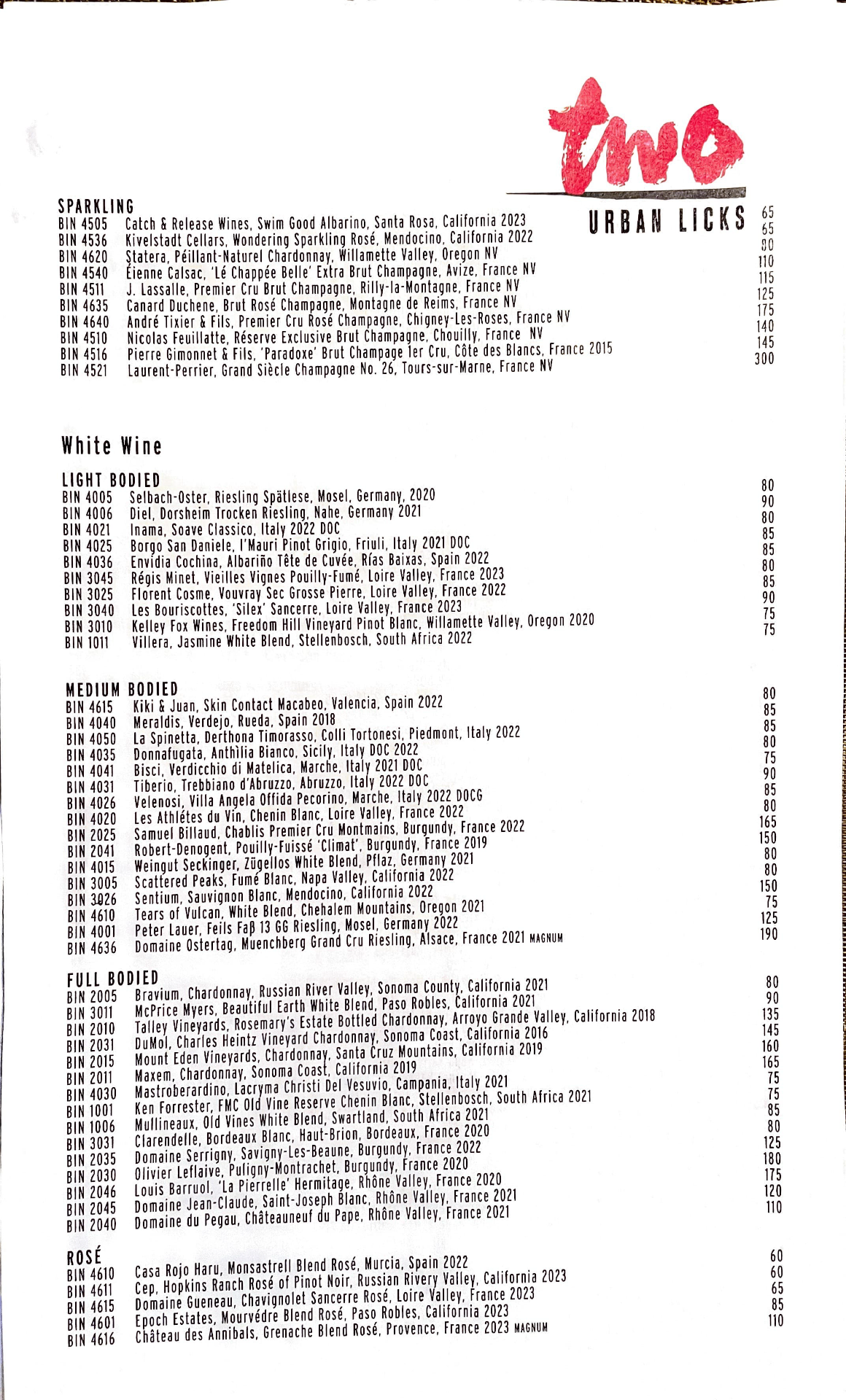
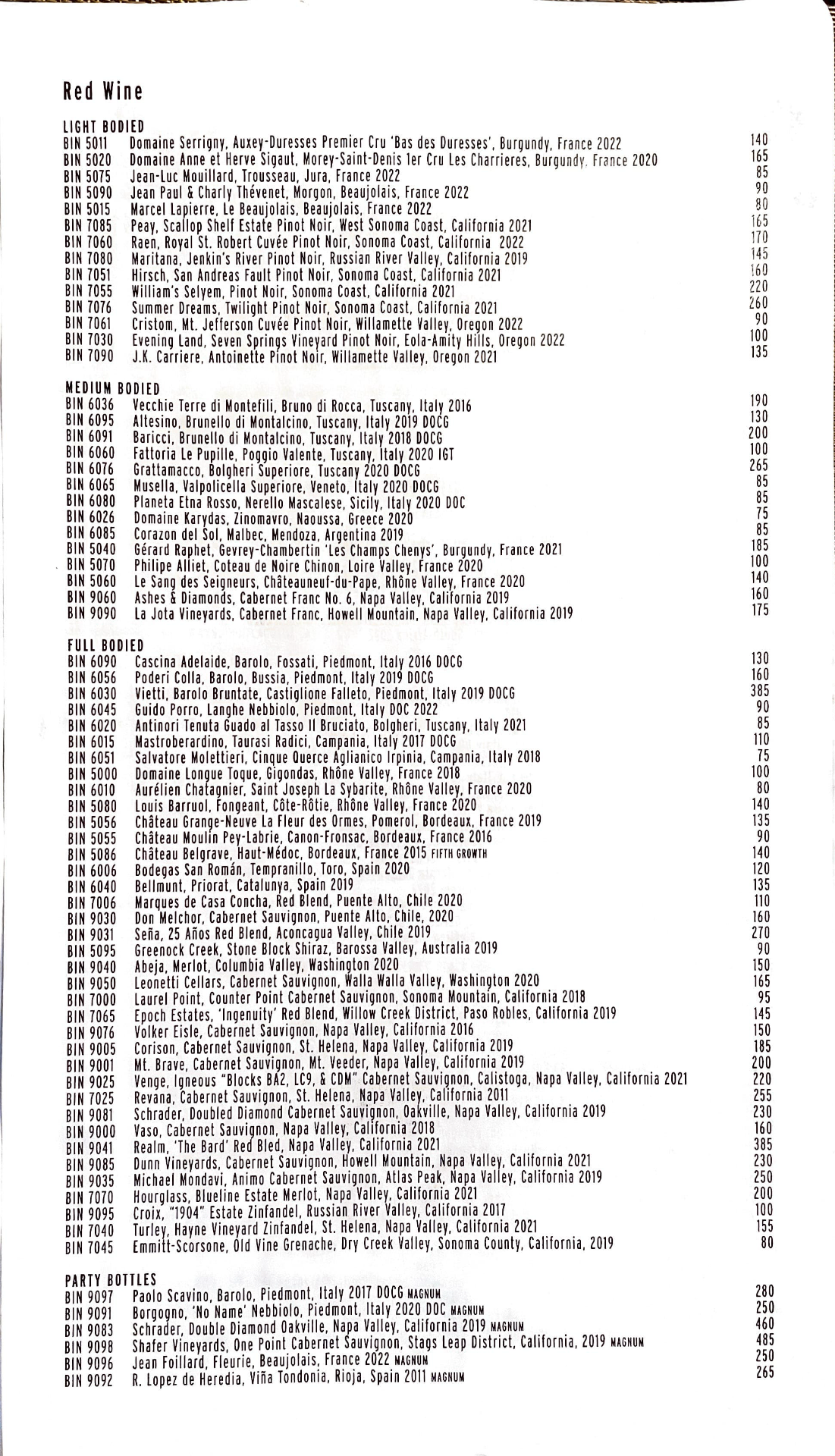
- — Static print, hard to update
- — No visuals of dishes
- — Flat hierarchy, weak storytelling

- + Editable in real time
- + On-brand, experiential
Why I chose Two Urban Licks.
Two Urban Licks is a trendy, industrial-style restaurant on Atlanta's East BeltLine, known for bold wood-fired dishes, Southern-inspired American cuisine, creative cocktails and wine on tap.
It's one of the most popular spots in Atlanta, right in the heart of the BeltLine — basically my backyard. I'm always there walking or skating, and I wanted to bring one of my closest friends to experience the ambiance.
I appreciate the minimal concept, but I think it could use a little more artistic flair. I saw it as a fun challenge to elevate the brand — to take what they'd done and push it further.
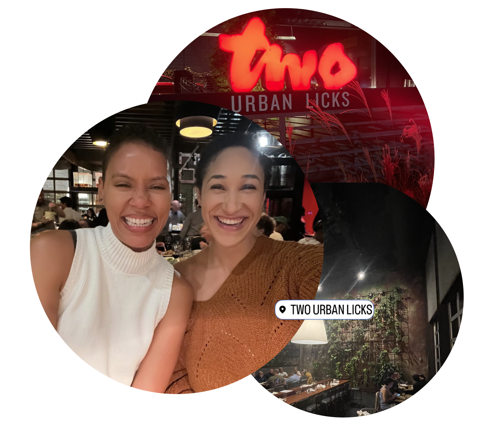
A brand as bold as the food.
The new Two Urban Licks identity carries the heat of the kitchen into every surface — from a numeral 2 carved into signage, to a napkin folded on a plate, to a tablet in a guest's hand.